In this post, you will learn about the Flutter Swiper package. Using this library, you can create image Carousel.

Let’s make a simple image carousel like above.
Create a Flutter project in Android Studio or Visual Studio. If you don’t know how to create a Flutter project in Android Studio, then read this post Android Studio Flutter Project Setup.
You can also use flutter commands to create project.
Let’s start with adding flutter_swiper dependency in pubspec.yaml.
flutter_swiper: ^1.1.6
Put below code in main.dart file
import 'package:flutter/material.dart';
import 'package:flutter_swiper/flutter_swiper.dart';

void main() {
  runApp(MyApp());
}

class MyApp extends StatelessWidget {
  final imageList = [
    'https://cdn.pixabay.com/photo/2016/03/05/19/02/hamburger-1238246__480.jpg',
    'https://cdn.pixabay.com/photo/2016/11/20/09/06/bowl-1842294__480.jpg',
    'https://cdn.pixabay.com/photo/2017/01/03/11/33/pizza-1949183__480.jpg',
    'https://cdn.pixabay.com/photo/2017/02/03/03/54/burger-2034433__480.jpg',
  ];

  @override
  Widget build(BuildContext context) {
    return MaterialApp(
      home: Scaffold(
        backgroundColor: Colors.grey,
        body: Swiper(
          itemCount: imageList.length,
          itemBuilder: (context, index) {
            return Image.network(
              imageList[index],
              fit: BoxFit.cover,
            );
          },
        ),
      ),
    );
  }
}
- imageList contains list of image urls.
- Specifies no. of images using itemCount property of Swiper.
- Swiper widget builds carousel using image urls with the help of Image.network widget.
- Flutter Notes Taking App Tutorial With Image Storing Feature
- FloatingActionButton in Flutter Tutorial

You can change scrollDirection using scrollDirection property.
scrollDirection: Axis.vertical,
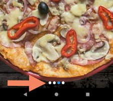
Now add some circle or dots at the bottom to understand how many slides are in the carousel.
pagination: SwiperPagination(),

Change dots and replace them with numbers.
pagination: SwiperPagination(builder: SwiperPagination.fraction),

Let’s add some control buttons on, left, and right sides.
control: SwiperControl(),
Now you can click on both buttons to change the slides or images without swiping.

Sometimes you need to change the color of arrows, then you can use the color property.
control: SwiperControl(color: Colors.black),
If you need to change images without swiping or taping control buttons, then you can use autoplay:true
Swiper(
          autoplay: true,
          itemCount: imageList.length,
          itemBuilder: (context, index) {
            return Image.network(
              imageList[index],
              fit: BoxFit.cover,
            );
          },
        //scrollDirection: Axis.vertical,
          //pagination: SwiperPagination(builder: SwiperPagination.fraction),
          //control: SwiperControl(color: Colors.black),
        ),
Okay. If you need to do any operation when tapping on the image, then you can use
Swiper(
          onTap: (index) {
            print(imageList[index]);
          },
          itemCount: imageList.length,
          itemBuilder: (context, index) {
            return Image.network(
              imageList[index],
              fit: BoxFit.cover,
            );
          },
          //autoplay: true,
          //scrollDirection: Axis.vertical,
          //pagination: SwiperPagination(builder: SwiperPagination.fraction),
          //control: SwiperControl(color: Colors.black),
        ),
- When user taps on image, it prints image url from the imageList
If you are trying to refresh the UI after onTap triggered, then you must convert the class into a StatefulWidget and call setState() inside onTap method block.
Stack Layout Example

In this example, you will learn how to make a stack layout carousel using the same Image URLs used in the first example.
import 'package:flutter/material.dart';
import 'package:flutter_swiper/flutter_swiper.dart';

void main() {
  runApp(MyApp());
}

class MyApp extends StatelessWidget {
  final imageList = [
    'https://cdn.pixabay.com/photo/2016/03/05/19/02/hamburger-1238246__480.jpg',
    'https://cdn.pixabay.com/photo/2016/11/20/09/06/bowl-1842294__480.jpg',
    'https://cdn.pixabay.com/photo/2017/01/03/11/33/pizza-1949183__480.jpg',
    'https://cdn.pixabay.com/photo/2017/02/03/03/54/burger-2034433__480.jpg',
  ];

  @override
  Widget build(BuildContext context) {
    return MaterialApp(
      home: Scaffold(
        body: Swiper(
          layout: SwiperLayout.STACK,
          itemCount: imageList.length,
          itemBuilder: (context, index) {
            return Image.network(
              imageList[index],
              fit: BoxFit.cover,
            );
          },
          itemWidth: 300.0,
          itemHeight: 300.0,
        ),
      ),
    );
  }
}
- Here layout property uses SwiperLayout.STACK.
- Image’s height and width set to 300.0
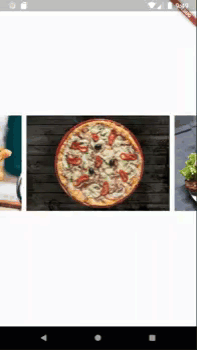
SwiperLayout Tinder Example

In this example, You will use SwiperLayout.TINDER for layout property.
import 'package:flutter/material.dart';
import 'package:flutter_swiper/flutter_swiper.dart';

void main() {
  runApp(MyApp());
}

class MyApp extends StatelessWidget {
  final imageList = [
    'https://cdn.pixabay.com/photo/2016/03/05/19/02/hamburger-1238246__480.jpg',
    'https://cdn.pixabay.com/photo/2016/11/20/09/06/bowl-1842294__480.jpg',
    'https://cdn.pixabay.com/photo/2017/01/03/11/33/pizza-1949183__480.jpg',
    'https://cdn.pixabay.com/photo/2017/02/03/03/54/burger-2034433__480.jpg',
  ];

  @override
  Widget build(BuildContext context) {
    return MaterialApp(
      home: Scaffold(
        appBar: AppBar(
          title: Text('Flutter Swiper TINDER Example'),
        ),
        body: Swiper(
          layout: SwiperLayout.TINDER,
          itemCount: imageList.length,
          itemBuilder: (context, index) {
            return Image.network(
              imageList[index],
              fit: BoxFit.cover,
            );
          },
          itemWidth: 400.0,
          itemHeight: 500.0,
        ),
      ),
    );
  }
}
Flutter Swiper Example – Using customLayoutOption
This is a simple customized example.
import 'package:flutter/material.dart';
import 'package:flutter_swiper/flutter_swiper.dart';

void main() {
  runApp(MyApp());
}

class MyApp extends StatelessWidget {
  final imageList = [
    'https://cdn.pixabay.com/photo/2016/03/05/19/02/hamburger-1238246__480.jpg',
    'https://cdn.pixabay.com/photo/2016/11/20/09/06/bowl-1842294__480.jpg',
    'https://cdn.pixabay.com/photo/2017/01/03/11/33/pizza-1949183__480.jpg',
    'https://cdn.pixabay.com/photo/2017/02/03/03/54/burger-2034433__480.jpg',
  ];

  @override
  Widget build(BuildContext context) {
    return MaterialApp(
      home: Scaffold(
          body: Swiper(
              layout: SwiperLayout.CUSTOM,
              customLayoutOption:
                  new CustomLayoutOption(startIndex: -1, stateCount: 3)
                      .addRotate([0.0 / 180, 0.0, 0.0 / 180]).addTranslate([
                new Offset(-310.0, 0.0),
                new Offset(0.0, 0.0),
                new Offset(310.0, 0.0) //for right element
              ]),
              itemWidth: 300.0,
              itemHeight: 200.0,
              itemBuilder: (context, index) {
                return Image.network(
                  imageList[index],
                  fit: BoxFit.cover,
                );
              },
              itemCount: imageList.length)),
    );
  }
}
So as an open-source, you can use this library and make your own Image Carousel.
That’s all for now. If you like this post, please share it with your family and friends.

