In this post, you will learn how to make stadium border-shaped widgets in Flutter. Rounded or stadium border type shape will look fresh and different when compared to rectangle-shaped widgets.
So here, you will see enough examples to learn and will get the confidence to make your own one.
Contents
What is Stadium Border in Flutter?

A border that looks like a stadium-shaped (a rectangle box with semicircles at the ends). StadiumBorder is frequently used with ShapeDecoration to create borders.
Let’s make one…
StadiumBorder Shape Using Container
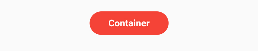
Container has decoration property. So use this property with ShapeDecoration and make StadiumBorder shape.
          Container(
                padding: EdgeInsets.symmetric(
                  horizontal: 30,
                  vertical: 10,
                ),
                decoration: ShapeDecoration(
                  color: Colors.red,
                  shape: StadiumBorder(),
                ),
                child: Text(
                  'Container',
                  style: TextStyle(
                    fontSize: 15,
                    color: Colors.white,
                    fontWeight: FontWeight.bold,
                  ),
                ),
              ),

Let’s add a small border to the container. In this example, I have added white color to the border.
 Container(
                padding: EdgeInsets.symmetric(
                  horizontal: 30,
                  vertical: 10,
                ),
                decoration: ShapeDecoration(
                  color: Colors.red,
                  shape: StadiumBorder(
                    side: BorderSide(
                      width: 2,
                      color: Colors.white,
                    ),
                  ),
                ),
                child: Text(
                  'Container',
                  style: TextStyle(
                    fontSize: 15,
                    color: Colors.white,
                    fontWeight: FontWeight.bold,
                  ),
                ),
              ),
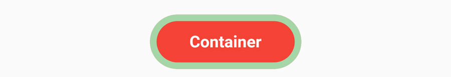
Let’s make the border a little bit big, add more width inside BorderSide.
              Container(
                padding: EdgeInsets.symmetric(
                  horizontal: 30,
                  vertical: 10,
                ),
                decoration: ShapeDecoration(
                  color: Colors.red,
                  shape: StadiumBorder(
                    side: BorderSide(
                      width: 6,
                      color: Colors.green[200]!,
                    ),
                  ),
                ),
                child: Text(
                  'Container',
                  style: TextStyle(
                    fontSize: 15,
                    color: Colors.white,
                    fontWeight: FontWeight.bold,
                  ),
                ),
              ),
StadiumBorder using Container – II

   Container(
                padding: EdgeInsets.symmetric(horizontal: 30, vertical: 10),
                decoration: ShapeDecoration(
                  shape: StadiumBorder(
                    side: BorderSide(width: 2, color: Colors.red),
                  ),
                ),
                child: Text(
                  'Container',
                  style: TextStyle(
                    fontSize: 20,
                    color: Colors.red,
                    fontWeight: FontWeight.bold,
                  ),
                ),
              ),
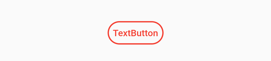
Stadium Border Using TextButton

In this example, you will use TextButton for making StadiumBorder. Use style property with ElevatedButton.styleFrom().
TextButton(
                onPressed: () {},
                child: Text(
                  'TextButton',
                  style: TextStyle(
                    color: Colors.white,
                  ),
                ),
                style: ElevatedButton.styleFrom(
                  primary: Colors.red,
                  shape: StadiumBorder(),
                ),
              ),
- Flutter Notes App Using Provider, Sqflite & ImagePicker
- Flutter QR Code Generator and Scanner With Sharing Feature.
- Flutter Hyperlink Text
- Password TextField In Flutter
StadiumBorder Using TextButton II
              TextButton(
                onPressed: () {},
                child: Text(
                  'TextButton',
                  style: TextStyle(
                    color: Colors.red,
                  ),
                ),
                style: ElevatedButton.styleFrom(
                  shape: StadiumBorder(
                    side: BorderSide(
                      width: 2,
                      color: Colors.red,
                    ),
                  ),
                ),
              ),

Most of the apps use StadiumBorder like above. Showing trending, hot or new categories on a horizontal list.
   TextButton(
                onPressed: () {},
                child: Text(
                  '#Trending',
                  style: TextStyle(
                    color: Colors.white,
                  ),
                ),
                style: ElevatedButton.styleFrom(
                  padding: EdgeInsets.symmetric(horizontal: 20, vertical: 10),
                  primary: Colors.red,
                  shape: StadiumBorder(),
                ),
              ),
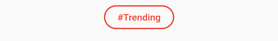
Let’s show the outline of TextButton with StadiumBorder.
 TextButton(
                onPressed: () {},
                child: Text(
                  '#Trending',
                  style: TextStyle(
                    color: Colors.red,
                  ),
                ),
                style: ElevatedButton.styleFrom(
                  padding: EdgeInsets.symmetric(horizontal: 20, vertical: 10),
                  shape: StadiumBorder(
                    side: BorderSide(
                      width: 2,
                      color: Colors.red,
                    ),
                  ),
                ),
              ),
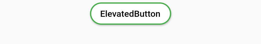
StadiumBorder Using ElevatedButton

This time we can use successor of RaisedButton aka ElevatedButton. It also have shape property. Then you know what to do.
     ElevatedButton(
                child: Text("ElevatedButton"),
                onPressed: () {},
                style: ElevatedButton.styleFrom(
                  primary: Colors.green,
                  shape: StadiumBorder(),
                ),
              ),
   ElevatedButton(
                child: Text(
                  "ElevatedButton",
                  style: TextStyle(
                    color: Colors.black,
                  ),
                ),
                onPressed: () {},
                style: ElevatedButton.styleFrom(
                  primary: Colors.white,
                  shape: StadiumBorder(
                      side: BorderSide(width: 2, color: Colors.green)),
                ),
              ),
StadiumBorder Using OutlinedButton
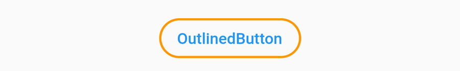
Just like TextButton and ElevatedButton, you can also create StadiumBorder shape with OutlinedButton.
OutlinedButton(
                child: Text("OutlinedButton"),
                onPressed: () {},
                style: OutlinedButton.styleFrom(
                  side: BorderSide(
                    width: 2,
                    color: Colors.orange,
                  ),
                  shape: StadiumBorder(),
                ),
              ),

Let’s create a Flutter project which contains all above examples.
- If you are using Android Studio – Use this link
If you are using Visual Studio – you can create project using Flutter Command and open through Visual Studio.
clear your main.dart file and paste the below code.
- Column widget is used to show widgets in vertical order.
- SizedBox widget used to make empty space between widgets.
- You can remove debug banner using this post.
import 'package:flutter/material.dart';

void main() {
  runApp(MyApp());
}

class MyApp extends StatelessWidget {
  @override
  Widget build(BuildContext context) {
    return MaterialApp(
      title: 'Stadium Border In Flutter',
      home: Scaffold(
        appBar: AppBar(
          title: Text('Flutter StadiumBorder Example'),
        ),
        body: Center(
          child: Column(
            mainAxisAlignment: MainAxisAlignment.center,
            crossAxisAlignment: CrossAxisAlignment.center,
            children: [
              TextButton(
                onPressed: () {},
                child: Text(
                  'TextButton',
                  style: TextStyle(
                    color: Colors.white,
                  ),
                ),
                style: ElevatedButton.styleFrom(
                  primary: Colors.red,
                  shape: StadiumBorder(),
                ),
              ),
              TextButton(
                onPressed: () {},
                child: Text(
                  'TextButton',
                  style: TextStyle(
                    color: Colors.red,
                  ),
                ),
                style: ElevatedButton.styleFrom(
                  shape: StadiumBorder(
                    side: BorderSide(
                      width: 2,
                      color: Colors.red,
                    ),
                  ),
                ),
              ),
              TextButton(
                onPressed: () {},
                child: Text(
                  '#Trending',
                  style: TextStyle(
                    color: Colors.white,
                  ),
                ),
                style: ElevatedButton.styleFrom(
                  padding: EdgeInsets.symmetric(horizontal: 20, vertical: 10),
                  primary: Colors.red,
                  shape: StadiumBorder(),
                ),
              ),
              SizedBox(
                height: 8,
              ),
              TextButton(
                onPressed: () {},
                child: Text(
                  '#Trending',
                  style: TextStyle(
                    color: Colors.red,
                  ),
                ),
                style: ElevatedButton.styleFrom(
                  padding: EdgeInsets.symmetric(horizontal: 20, vertical: 10),
                  shape: StadiumBorder(
                    side: BorderSide(
                      width: 2,
                      color: Colors.red,
                    ),
                  ),
                ),
              ),
              SizedBox(
                height: 8,
              ),
              Container(
                padding: EdgeInsets.symmetric(
                  horizontal: 30,
                  vertical: 10,
                ),
                decoration: ShapeDecoration(
                  color: Colors.red,
                  shape: StadiumBorder(),
                ),
                child: Text(
                  'Container',
                  style: TextStyle(
                    fontSize: 15,
                    color: Colors.white,
                    fontWeight: FontWeight.bold,
                  ),
                ),
              ),
              SizedBox(
                height: 8,
              ),
              Container(
                padding: EdgeInsets.symmetric(
                  horizontal: 30,
                  vertical: 10,
                ),
                decoration: ShapeDecoration(
                  color: Colors.red,
                  shape: StadiumBorder(
                    side: BorderSide(
                      width: 6,
                      color: Colors.green[200]!,
                    ),
                  ),
                ),
                child: Text(
                  'Container',
                  style: TextStyle(
                    fontSize: 15,
                    color: Colors.white,
                    fontWeight: FontWeight.bold,
                  ),
                ),
              ),
              SizedBox(
                height: 8,
              ),
              Container(
                padding: EdgeInsets.symmetric(horizontal: 30, vertical: 10),
                decoration: ShapeDecoration(
                  shape: StadiumBorder(
                    side: BorderSide(width: 2, color: Colors.red),
                  ),
                ),
                child: Text(
                  'Container',
                  style: TextStyle(
                    fontSize: 20,
                    color: Colors.red,
                    fontWeight: FontWeight.bold,
                  ),
                ),
              ),
              ElevatedButton(
                child: Text("ElevatedButton"),
                onPressed: () {},
                style: ElevatedButton.styleFrom(
                  primary: Colors.green,
                  shape: StadiumBorder(),
                ),
              ),
              ElevatedButton(
                child: Text(
                  "ElevatedButton",
                  style: TextStyle(
                    color: Colors.black,
                  ),
                ),
                onPressed: () {},
                style: ElevatedButton.styleFrom(
                  primary: Colors.white,
                  shape: StadiumBorder(
                      side: BorderSide(width: 2, color: Colors.green)),
                ),
              ),
              OutlinedButton(
                child: Text("OutlinedButton"),
                onPressed: () {},
                style: OutlinedButton.styleFrom(
                  side: BorderSide(
                    width: 2,
                    color: Colors.orange,
                  ),
                  shape: StadiumBorder(),
                ),
              ),
            ],
          ),
        ),
      ),
    );
  }
}
That’s all for now. If you like this post, please share it with your family and friends.