ENIAC, the first computer, could perform 5,000 additions per second. In comparison, an average person can perform approximately 0.4 additions per second.
This means the first computer was about 12,500 times faster than a human.
Now, in today’s world, computers can perform billions of operations per second. When machines, particularly computers, learn to imitate human behavior—through machine learning—the potential is extraordinary.
They can outperform us in a matter of seconds.
So, let’s talk about the advantages of Machine Learning.
Automated decision without human intervention
One of the noted advantage is that, it does not need a human intervention for making decisions. It will think like human or based how the model is set it up, and make decisions.
It will do as same like human do and sometimes better, especially in repetitive, data-driven, or time-sensitive scenarios.
Personalization
Every client or user is treated as a top priority, No differentiation occurs—each user receives the same level of attention and care. Based on individual patterns, preferences, likes, and dislikes, machine learning models understand what to suggest and what to avoid.
For example, platforms like YouTube, Netflix, and Amazon use machine learning to power their recommendation systems. These systems treat each user uniquely, tailoring content or product suggestions to match personal behavior and interests.
24*7 availability
They are available whenever anyone needs them. No need for rest, sleep, or food like humans do. It means, whenever people need any help from deployed machine learning, it will be done.
Improvement Over Time
Just like experienced professionals improve with time, machine learning models also get better as they are exposed to more data. As the model continues to receive new data after deployment—even data it wasn’t originally trained or tested on—it can adapt, refine its predictions, and improve overall performance.
Using techniques like continuous learning or model retraining, the system becomes more accurate and efficient in handling real-world scenarios.
Handles Large Sets of Data
In this information age, there is a vast amount of data in various formats—text, audio, video, and more. It is very difficult for humans to handle all this data accurately because the chances of mistakes are high. However, machines operate using only 0s and 1s (binary), so they convert every type of data into this format to process and understand it efficiently. While humans converting data into binary might become complex as data volume grows, machines are built to handle and process large datasets quickly and accurately.
Less cost when compared to human
In the long term, its cost is considered to be less compared to humans, and machines can work 24*7. Once implemented, the ongoing costs—such as maintenance, updates, and electricity—are relatively low when spread over many years.
This makes machine learning a cost-effective solution for businesses looking to automate processes and improve efficiency.
New ML Job Opportunities
In the job zone, ML has come with new opportunities such as:
- Data Scientist
- ML Engineer
- MLOps Engineer
- Prompt Engineer
with competitive salary.
Beyond technical roles, ML is also creating opportunities in ethical AI, AI policy, and AI product management, reflecting the broader ecosystem around machine learning technologies.
Disadvantages of Machine Learning
Just like its advantages, Machine Learning also has disadvantages.
Let’s talk about that too.
Large Data Needed for Training
The model needs to be trained on a large number of high-quality datasets. If the dataset is small or of low quality, it may lead to poor or average predictions. The model also needs to be trained with new data regularly; otherwise, the ML model will degrade over time.
Resources for Training Are Expensive
For large ML models, training requires CPUs or GPUs. This is actually very expensive, both for renting and buying. They also need expensive infrastructure, as training produces heat that must be controlled to ensure better performance and to prevent overheating.
Job Loss
Due to automation of tasks and significantly better output in less time, there may be increased job losses in different sectors. Most companies have started using AI, which may result in job loss for new joiners or less experienced people. However, ML also creates new opportunities based on machine learning. Still, data typing and most basic tasks are expected to be handled by AI or machine learning in the future.
Manipulation with Malicious Data
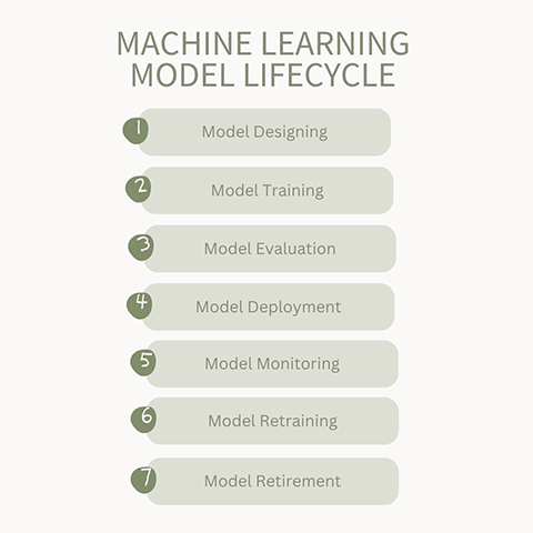
Biased and malicious data can significantly alter decisions and lead to incorrect predictions. Manipulation can happen at any time—it may occur during fine-tuning with user feedback or from biased data collected during scraping or training in the machine learning model lifecycle.
Lack of Transparency in How Decisions Are Made (Black Box Problem)
It is often unclear how decisions are made based on the data. In some cases, it is difficult to understand why a particular outcome occurred. This lack of transparency makes debugging and improving predictions more challenging.
Reference: