FlatButton is replaced by TextButton.
There are many widgets in Flutter to make a better user interface. In every UI, Buttons have their own important role.
From this post, you will start to learn about the Flutter button widgets. Such as FlatButton, RaisedButton, FloatingActionButton, and more.
So let’s start with Flutter FlatButton.
Contents
Flutter FlatButton

Flat Button ??
Yes, Because by default, it’s just a black text or label without any
- borders
- elevation
You can use flatbutton in toolbars, dialogs, cards, and where ever enough space to add. Flatbutton also make the icon widget using FlatButton.icon().
FlatButton Simple Example
So let’s start programming and make a simple FlatButton like below. You can create flutter project using flutter command or with the help of Android Studio.

import 'package:flutter/material.dart';

void main() => runApp(MyApp());

class MyApp extends StatelessWidget {
  @override
  Widget build(BuildContext context) {
    return MaterialApp(
      home: FlatButton(
        child: Text('FlatButton'),
        color: Colors.white,
        onPressed: () {
          print("FlatButton tapped");
        },
      ),
    );
  }
}
- App gets started execution from main method. At last, build() method renders FlatButton with the help of MaterialApp.
- If you do not use the MaterialApp in above code, it could result in No directionality widget found error.
- I have used white color as FlatButton background using the color property. Otherwise, you could get a black screen with debug banner.
- Already told you FlatButton text color is black by default
Check it out by removing color: Colors.white line from above code and reload.
FlatButton Properties
Let’s talk about the properties of FlatButton.

1. VoidCallback onPressed: It gets called when FlatButton is tapped, You need to pass VoidCallback method, means no arguments and no return value.
For ex: void myFunction();
If you haven’t provided onPressed property or specified null value, then the button will look like in the first one from the above image.
If you have given a method name or anonymous function then the button will look like in the second one.
Okay. How to provide values to onPressed property.
-
Using anonymous function
-
Using function name
- ButtonTextTheme.Normal
- ButtonTextTheme.accent
- ButtonTextTheme.primary
- EdgeInsets.all() – Give enough padding to all sides of button’s text. Above code will apply 50 padding for all sides of the Text(Top, Bottom, Left and Right).
- EdgeInsets.only() – It gives padding to the only specified side. You can specify one or more sides like below.
- EdgeInsets.symmetric() – You can provide values in horizontal and vertical directions.
- Border width is 2.0 and color is pink.
- Provided icon and label to FlatButton.icon()
- centerTitle: true – It makes AppBar title to center.
- Application starts execution from main() function.
- The build() function builds user interface.
- when we tap on the button, it increases counter variable by 1 and also calls setState().
- The setState() function calls build() method again.
FlatButton(
            onPressed: () {
           //implement your code.
},
           .....
 ),
void flatButtonTapped(){

}

FlatButton(onPressed: flatButtonTapped,

)
You don’t need to give parentheses ‘()’ here. Only the function name. Download all source code from the top link.
2. VoidCallback onLongPress
This property gets called when a long tap occurs. Just like onPressed property, pass an anonymous function or method name.
FlatButton(onLongPress: (){},
3. ValueChanged

onHighlightChanged calls when you click down or up the button. When the button clicks down, it gives true value. false when button clicks up.
FlatButton(
            child: Text('FlatButton'),
            onHighlightChanged: (value) {
              print('onHighlightChanged value : $value');
            },
            onPressed: () {
              //onpressed gets called when the button is tapped.
            },
          ),
4. ButtonTextTheme textTheme
It control the button’s text color based on the theme. There are 3 values
you can use like this
textTheme: ButtonTextTheme.normal.
It shows color based on your theme and swatch.
5. Color textColor

It determines button label’s or text color.
FlatButton(
            onPressed: () {},
            child: Text("Login"),
            textColor: Colors.indigo,
          ),
6. Color disabledTextColor

The color is used to display when the button is disabled. set null to onPressed.
FlatButton(
                child: Text('Flat Button - Default Disabled Text Color'),
                onPressed: null,
              ),
              FlatButton(
                child: Text('Flat Button - Custom Disabled Text Color'),
                onPressed: null,
                disabledTextColor: Colors.black54,
              ),
7. Color highlightColor
Highlight property uses to highlight the button when it pressed. After the tap event, highlightColor spreads to fill the whole button and fade out.
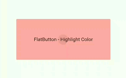
FlatButton(
          padding: EdgeInsets.all(80),
          highlightColor: Colors.redAccent,
          child: Text('FlatButton - highlight Color'),
           onPressed: () {
            //onpressed gets called when the button is tapped.
            print("FlatButton tapped");
          },
        ),
8. Color splashColor
When the button tapped, splashColor or tap event behaves as something falls into the liquid.

FlatButton(
                   child: Text('Button'),
                   onPressed: (){},
                   splashColor: Colors.red,
        )
9. Brightness colorBrightness

It’s used to increase the readability of text in Button. Use Brightness.light for light and Brightness.dark for dark background color.
FlatButton(
                child: Text('FlatButton - Brightness.light'),
                colorBrightness: Brightness.light,
                color: Colors.limeAccent,
                onPressed: () {
                  //onpressed gets called when the button is tapped.
                  print("flat button tapped");
                },
              ),
              FlatButton(
                child: Text('FlatButton - Brightness.dark'),
                colorBrightness: Brightness.dark,
                color: Colors.deepPurple,
                onPressed: () {
                  //onpressed gets called when the button is tapped.
                  print("flat button tapped");
10. EdgeInsetsGeometry padding
padding property helps us to specify the padding of FlatButton internal child. Here internal child is Text widget.

FlatButton(
                child: Text('FlatButton'),
                onPressed: () {},
                padding: EdgeInsets.all(50),
                color: Color(0xFFFFD8C8),
              ),


  FlatButton(
                child: Text('FlatButton'),
                onPressed: () {},
                color: Color(0xFFFC6453),
                padding: EdgeInsets.only(top: 10, left: 30, right: 20),
              ),

  FlatButton(
                child: Text('FlatButton'),
                onPressed: () {},
                color: Color(0xFF534858),
                colorBrightness: Brightness.dark,
                padding: EdgeInsets.symmetric(horizontal: 50),
              ),

              FlatButton(
                child: Text('FlatButton'),
                onPressed: () {},
                color: Color(0xFF534858),
                colorBrightness: Brightness.dark,
                padding: EdgeInsets.symmetric(vertical: 50),
              ),
              Padding(
                padding: EdgeInsets.all(10),
              ),
              FlatButton(
                child: Text('FlatButton'),
                onPressed: () {},
                color: Color(0xFF534858),
                colorBrightness: Brightness.dark,
                padding: EdgeInsets.symmetric(horizontal: 50, vertical: 30),
              ),
11. ShapeBorder shape
Shape property gives different options to make different shapes of flatbutton. Let’s make a rectangle FlatButton using shape property with the help of Border.all().

FlatButton(onPressed: (){}, child: Text('OK'),
          shape: Border.all(width: 2.0, color: Colors.pink),),
StadiumBorder shape

 FlatButton(
                onPressed: () {},
                child: Text('StadiumBorder'),
                shape: StadiumBorder(),
                color: Colors.pink,
                textColor: Colors.white,
              ),
CircleBorder
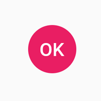
FlatButton(
                onPressed: () {},
                child: Text('OK'),
                shape: CircleBorder(),
                color: Colors.pink,
                textColor: Colors.white,)
CircleBorder with Side
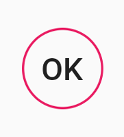
 FlatButton(
                onPressed: () {},
                child: Text('OK'),
                shape: CircleBorder(
                  side: BorderSide(
                    color: Colors.pink,
                  ),
                ),
              )
Rounded Rectangle Border
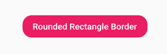
FlatButton(
                child: Text('Rounded Rectangle Border'),
                onPressed: () {},
                shape: RoundedRectangleBorder(
                    borderRadius: BorderRadius.circular(15)),
                color: Colors.pink,
                textColor: Colors.white,
              )
Beveled Rectangle Border
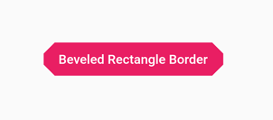
FlatButton(
                onPressed: () {},
                child: Text('Beveled Rectangle Border'),
                shape: BeveledRectangleBorder(
                  borderRadius: BorderRadius.circular(12),
                ),
                color: Colors.pink,
                textColor: Colors.white,
              ),
Outline Input Border
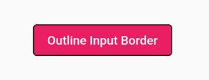
FlatButton(
                onPressed: () {},
                child: Text('Outline Input Border'),
                shape: OutlineInputBorder(),
                color: Colors.pink,
                textColor: Colors.white,
              ),
YOu can create underline using shape.
Underline Input Border

 FlatButton(
                onPressed: () {},
                child: Text('Underline Input Border'),
                shape: UnderlineInputBorder(),
                color: Colors.pink,
                textColor: Colors.white,
              ),
FlatButton.Icon Example
Let’s create the Icon button using FlatButton.Icon
import 'package:flutter/material.dart';

void main() => runApp(MyApp());

class MyApp extends StatelessWidget {
  @override
  Widget build(BuildContext context) {
    return MaterialApp(
      title: 'FlatButton Icon Ex',
      theme: ThemeData(
        primarySwatch: Colors.blue,
      ),
      home: Scaffold(
        appBar: AppBar(title: Text('FlatButton Icon Example'),
        centerTitle: true,),//it makes appbar title to center
        body: Center(
          child: FlatButton.icon(
            icon: Icon(Icons.add_alarm),//icon image
            label: Text('Add alarm'),//text to show in button
            textColor: Colors.white,//button text and icon color.
            color: Colors.green,//button background color
            onPressed: () {},
          ),
        ),
      ),
    );
  }
}
Flutter FlatButton onPressed Example – Counter Button

In this example, you will learn how to change count using Flutter FlatButton. Final output will be like above image. Okay, Let’s start.
import 'package:flutter/cupertino.dart';
import 'package:flutter/material.dart';

void main() => runApp(MyApp());

class MyApp extends StatefulWidget {
  @override
  _MyAppState createState() => _MyAppState();
}

class _MyAppState extends State {
  int counter = 0;

  @override
  Widget build(BuildContext context) {
    return MaterialApp(
      home: Scaffold(
        appBar: AppBar(
          title: Text('FlatButton onPressed Example'),
        ),
        body: Column(
          mainAxisAlignment: MainAxisAlignment.center,
          children: [
            Center(
              child: Text(
                '$counter',
                style: TextStyle(fontSize: 60.0),
              ),
            ),
            SizedBox(
              height: 20,
            ),
            FlatButton(
              child: Text('CHANGE COUNT'),
              onPressed: (){
                setState(() {
                  counter = counter + 1;
                });
              },
           color: Colors.red,
              textColor: Colors.white,
            ),
          ],
        ),
      ),
    );
  }
}
Assume you liked this post, please share it with your family and friends.
More information about Flutter FlatButton: FlatButton docs
