
Let’s learn about Flutter RaisedButton.
RaisedButton…?
How is it look like?
How to add it to my code?
Okay… wait.
After reading this post, you will learn a lot more about RaisedButton.
then don’t waste my time. Please start.
Here we go.
Contents
Flutter RaisedButton

From the title, you can understand that It’s a raised button.
Yes, it is.
Actually the button appears elevated or in more detail, it placed higher than the surrounding area or page. It shows more shadow when the button is tapped.
You can also make icon using RaisedButton.
But now, let’s make a simple RaisedButton. You can create flutter project using flutter command or Android Studio.

import 'package:flutter/material.dart';

void main() => runApp(MyApp()); //application entry point, Calls MyApp

class MyApp extends StatelessWidget {
  @override
  Widget build(BuildContext context) {
    return MaterialApp(
      home: Scaffold(
        appBar: AppBar(
          title: Text('Flutter RaisedButton Example'),
        ),
        body: Center(
          child: RaisedButton(
            child: Text('RaisedButton'),
            onPressed: () {
              //onpressed gets called when the button is tapped.
              print("RaisedButton clicked");
            },
          ),
        ),
      ),
    );
  }
}
RaisedButton properties
1. VoidCallback onPressed
Just like FlatButton, RaisedButton invokes onPressed when button tapped. you can provide values in two ways.
-
Using anonymous function
-
By specifying the Function name
In this way, you don’t need to specify method’s name. It’s actually helpful when you want to execute simple lines of unrepeated code.
RaisedButton(
            child: Text('RaisedButton'),
            color: Colors.white,
            onPressed: () {
              print("RaisedButton tapped - anonymous function");
            },
            ),
Specify the function name as onPressed value. just like below
RaisedButton(
            child: Text('RaisedButton'),
            color: Colors.white,
             onPressed: raisedButtonTapped,
          ),

void raisedButtonTapped() {
    print("RaisedButton tapped - Using function");
  }
2. VoidCallback onLongPress
It gets called when RaisedButton pressed for a finite long time. You can use those ways I have told above in onPressed property.
-
Using Anonymous Function
-
Using Function name
RaisedButton(
            child: Text('RaisedButton'),
            color: Colors.white,
            onPressed: () {},
            onLongPress: () {
              print("RaisedButton long pressed - Using anonymous function");
            },

          ),
RaisedButton(
            child: Text('RaisedButton'),
            color: Colors.white,
            onPressed: () {},
            onLongPress: raisedButtonTapped,
          ),
...
..
  void raisedButtonTapped() {
    print("RaisedButton long pressed - Using function name");
  }
3. ValueChanged onHighlightChanged

onHighlightChanged property gives you true value when the button is tapped down and gives false after the release of the button.
4.Color textColor

The textColor property helps to change text color on RaisedButton.
RaisedButton(
            onPressed: () {},
            child: Text("SIGN IN"),
            textColor: Colors.red,
          ),
5. Color disabledTextColor

It assist us to change Button’s text color when onPressed provided with a null value.
RaisedButton(
                child: Text('RaisedButton - Default Disabled Text Color'),
                onPressed: null,
              ),
              RaisedButton(
                child: Text('RaisedButton - Custom Disabled Text Color'),
                onPressed: null,
                disabledTextColor: Colors.black,
              ),
6. Color color

The color property used to set RaisedButton background. You can change it to a different color rather than default one.
RaisedButton(
            child: Text('RaisedButton'),
            color: Colors.yellow,
            onPressed: () {},
          ),
7. Color disabledColor

Sometimes you need to disable the button and change it’s color, then apply disabledColor property like shown below. Just specify color as disabledColor property value.
RaisedButton(
                child: Text('RaisedButton - Default Disabled Color'),
                onPressed: null,
              ),
              RaisedButton(
                  child: Text('RaisedButton - Custom Disabled Color & Text'),
                  onPressed: null,
                  disabledTextColor: Colors.white60,
                  disabledColor: Colors.blueAccent),
8. FocusNode focusNode
It’s a focus related property, utilize focusNode property to set focus to RaisedButton. Look at the focusColor property, the given below how to use focusNode.
9.Color focusColor

When RaisedButton gets the focus, focusColor property helps us to change the color of RaisedButton.
import 'package:flutter/material.dart';

void main() {
  runApp(HomeScreen());
}

class HomeScreen extends StatefulWidget {
  @override
  _HomeScreenState createState() => _HomeScreenState();
}

class _HomeScreenState extends State {
  FocusNode _raisedFocusNode;

  @override
  void initState() {
    super.initState();
    _raisedFocusNode = FocusNode();
  }

  @override
  void dispose() {
    _raisedFocusNode.dispose();
    super.dispose();
  }

  @override
  Widget build(BuildContext context) {
    return MaterialApp(
      title: "RaisedButton FocusColor Example",
      home: Scaffold(
        appBar: AppBar(
          title: Text("RaisedButton FocusColor Example"),
        ),
        body: Column(
          crossAxisAlignment: CrossAxisAlignment.center,
          mainAxisAlignment: MainAxisAlignment.center,
          children: [
            Padding(
              padding: const EdgeInsets.all(18.0),
              child: TextField(
                onChanged: (value) =>
                    FocusScope.of(context).requestFocus(_raisedFocusNode),
              ),
            ),
            RaisedButton(
              color: Colors.blue,
              focusNode: _raisedFocusNode,
              focusColor: Colors.red,
              child: Text("DONE"),
              onPressed: () {
                print("RaisedButton clicked");
              },
            )
          ],
        ),
      ),
    );
  }
}
- When you enter a key in TextField, it calls onChanged and make request to the _raisedFocusNode
- RaisedButton’s focusNode value is _raisedFocusNode. When the RaisedButton gets focus, focusColor invokes and shows Red color
10.Color hoverColor
Use this property to change color when the pointer is hovering over the button. There is no hovering action in Mobile devices.
11.Color highlightColor

highlightColor property uses to highlight the RaisedButton When it tapped.
RaisedButton(
          padding: EdgeInsets.all(25),
          highlightColor: Colors.redAccent,
          child: Text('RaisedButton - highlight Color'),
          onPressed: () {
            //onpressed gets called when the button is tapped.
            print("RaisedButton tapped");
          },
        ),
12. Color splashColor
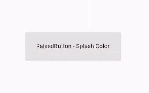
splashColor property shows animation when touches the button, Like something falls into liquid.
RaisedButton(
          padding: EdgeInsets.all(100),
          splashColor: Colors.redAccent,
          child: Text('RaisedButton - Splash Color'),
          //makes background color white
          onPressed: () {
            //onpressed gets called when the button is tapped.
            print("FlatButton tapped");
          },
        ),
13. Brightness colorBrightness

If colorBrightness is Brightness.light, then text color set to Black, otherwise text color set to white.
RaisedButton(
                child: Text('RaisedButton - Brightness.light'),
                colorBrightness: Brightness.light,
                color: Colors.blue[100],
                onPressed: () {
                  //onpressed gets called when the button is tapped.
                  print("RaisedButton tapped");
                },
              ),
              RaisedButton(
                child: Text('RaisedButton - Brightness.dark'),
                colorBrightness: Brightness.dark,
                color: Colors.black,
                onPressed: () {
                  //onpressed gets called when the button is tapped.
                  print("RaisedButton tapped");
                },
              ),
14. double elevation

By increasing elevation, you can see RaisedButton is more floating above the page and shadow spreads too.
RaisedButton(
          elevation: 5.0,
          color: Color(0xFFCE93D8),
          child: Text('RaisedButton - Elevation'),
          onPressed: () {
            //onpressed gets called when the button is tapped.
            print("RaisedButton tapped");
          },
        ),
15. double focusElevation

This property used to elevate or make shadow when the RaisedButton gets focus.
         import 'package:flutter/material.dart';

void main() {
  runApp(HomeScreen());
}

class HomeScreen extends StatefulWidget {
  @override
  _HomeScreenState createState() => _HomeScreenState();
}

class _HomeScreenState extends State {
  FocusNode _raisedFocusNode;

  @override
  void initState() {
    super.initState();
    _raisedFocusNode = FocusNode();
  }

  @override
  void dispose() {
    _raisedFocusNode.dispose();
    super.dispose();
  }

  @override
  Widget build(BuildContext context) {
    return MaterialApp(
      title: "RaisedButton focusElevation Example",
      home: Scaffold(
        appBar: AppBar(
          title: Text("RaisedButton focusElevation Example"),
        ),
        body: Column(
          crossAxisAlignment: CrossAxisAlignment.center,
          mainAxisAlignment: MainAxisAlignment.center,
          children: [
            Padding(
              padding: const EdgeInsets.symmetric(horizontal: 20.0),
              child: TextField(
                onChanged: (_) {
                  FocusScope.of(context).requestFocus(_raisedFocusNode);
                },
              ),
            ),
            RaisedButton(
              color: Colors.deepOrange[300],
              focusNode: _raisedFocusNode,
              focusElevation: 8.0,
              child: Text("DONE"),
              onPressed: () {},
            )
          ],
        ),
      ),
    );
  }
}
16. double hoverElevation
The hoverElevation property makes RaisedButton elevated when the pointer hovers over the RaisedButton.
17. double highlightElevation

The highlightElevation property can be used to show more shadow when the RaisedButton pressed. By default, highlightElevation value is 8.0
RaisedButton(
          color: Colors.red,
          textColor: Colors.white,
          highlightElevation: 15.0,
          child: Text('RaisedButton - highlight elevation'),
          onPressed: () {
            //onpressed gets called when the button is tapped.
            print("RaisedButton tapped");
          },
        ),
18.double disabledElevation
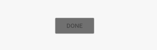
By default, disabled Elevation is 0.0, you can customize it using like below.
RaisedButton(
            disabledElevation: 1.0,
            child: Text("DONE"),
            onPressed: null,
          ),
19. EdgeInsetsGeometry padding

- padding property used to generate space between child widget and Borders of the Parent widget. Here, RaisedButton.
- padding property needs EdgeInsets value.
- Here EdgeInsets.all(50) means give 50 padding to all sides of the child or Text widget.
RaisedButton(
                child: Text('RaisedButton'),
                onPressed: () {},
                padding: EdgeInsets.all(50),
                color: Color(0xFFFFAA4D),
              ),

- If you want to move text child to certain sides only, then you can use EdgeInsets.only()
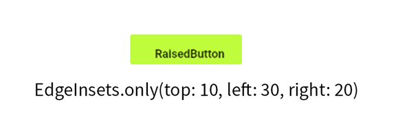
- You can specify more than one side.

- You can specify horizontal or vertical sides by applying EdgeInsets.symmetric().
20. Widget child
Just like almost other Flutter widgets, RaisedButton also gives child property to hold other widget.
Most of the time the child must be Text. But you can use others too. For example, the Image.
21. autofocus
RaisedButton’s autofocus is false by default. you can turn it on by adding autofocus:true.
22.Flutter RaisedButton Shapes Example
Shape Using Border.all()
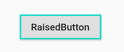
RaisedButton(
                onPressed: () {},
                child: Text('RaisedButton'),
                shape: Border.all(
                  width: 2.0,
                  color: Color(
                    0xFF03DAC5,
                  ),
                ),
              ),
StadiumBorder

RaisedButton(
                onPressed: () {},
                child: Text('StadiumBorder'),
                shape: StadiumBorder(),
                color: Color(
                  0xFF03DAC5,
                ),
              ),
CircleBorder
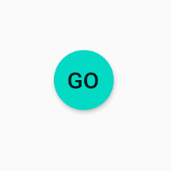
  RaisedButton(
                onPressed: () {},
                child: Text('GO'),
                shape: CircleBorder(),
                color: Color(
                  0xFF03DAC5,
                ),
              ),
CircleBorder with BorderSide

RaisedButton(
                onPressed: () {},
                child: Text('OK'),
                color: Colors.amber[100],
                shape: CircleBorder(
                  side: BorderSide(
                    color: Color(
                      0xFF03DAC5,
                    ),
                  ),
                ),
              ),
Rounded Rectangular Border

RaisedButton(
                child: Text('Rounded Rectangle Border'),
                onPressed: () {},
                shape: RoundedRectangleBorder(
                    borderRadius: BorderRadius.circular(15)),
                color: Colors.amber[100],
              ),
Beveled Rectangular Border

RaisedButton(
                onPressed: () {},
                child: Text('Beveled Rectangle Border'),
                shape: BeveledRectangleBorder(
                  borderRadius: BorderRadius.circular(12),
                ),
                color: Colors.amber[100],
              ),
OutlineInputBorder

RaisedButton(
                onPressed: () {},
                child: Text('Outline Input Border'),
                shape: OutlineInputBorder(),
                color: Colors.amber[100],
              ),
UnderlineInputBorder

RaisedButton(
                onPressed: () {},
                child: Text('Underline Input Border'),
                shape: UnderlineInputBorder(),
                color: Colors.amber[100],
              ),
How To Change Width & Height Of RaisedButton

In this example, You will change RaisedButton height and width using ButtonTheme.
Padding(
            padding: const EdgeInsets.all(8.0),
            child: ButtonTheme(
              minWidth: double.infinity,
              height: 50.0,
              child: RaisedButton(
                color: Colors.amber[300],
                onPressed: () {},
                child: Text('RaisedButton'),
              ),
            ),
          ),
- Here ButtonTheme helps to customize RaisedButton
- minWidth: double.infinity means minimum width must be same as parent.
- height: 50.0
- If you remove padding widget, RaisedButton will stretch to screen.
RaisedButton With Image Icon Example in Flutter
import 'package:flutter/material.dart';

void main() => runApp(MyApp());

class MyApp extends StatelessWidget {
  @override
  Widget build(BuildContext context) {
    return MaterialApp(
      home: Scaffold(
        appBar: AppBar(
          title: Text('RaisedButton Icon Example'),
        ),
        body: Center(
          child: RaisedButton.icon(
            onPressed: () {
              print('RaisedButton.icon clicked');
            },
            icon: Icon(Icons.attach_file), //icon image
            label: Text('Attach File'), //text to show in button
            textColor: Colors.white, //button text and icon color.
            color: Colors.red[400],
          ),
        ),
      ),
    );
  }
}
Flutter Gradient RaisedButton Example

Let’s make a Gradient Button…
import 'package:flutter/material.dart';

void main() {
  runApp(MyApp());
}

class MyApp extends StatelessWidget {
  @override
  Widget build(BuildContext context) {
    return MaterialApp(
      home: Scaffold(
        appBar: AppBar(
          title: Text('Gradient RaisedButton Example'),
        ),
        body: Center(
          child: RaisedButton(
            textColor: Colors.white,
            padding: EdgeInsets.all(0.0),
            shape: StadiumBorder(),
            child: Container(
              decoration: BoxDecoration(
                borderRadius: BorderRadius.circular(25.0),
                gradient: LinearGradient(
                  colors: [
                    Color(0xFF00b09b),
                    Color(0xFF96c93d),
                  ],
                ),
              ),
              child: Text(
                'ANDROIDRIDE',
                style: TextStyle(fontSize: 15.0),
              ),
              padding: EdgeInsets.symmetric(horizontal: 70.0, vertical: 15.0),
            ),
            onPressed: () {
              print('Gradient RaisedButton clicked');
            },
          ),
        ),
      ),
    );
  }
}
Flutter RaisedButton Example – Data from List

In this example, you will create an application that will display items in the list using RaisedButton.
import 'package:flutter/material.dart';

void main() {
  runApp(
    MyApp(),
  );
}

class MyApp extends StatefulWidget {
  @override
  _MyAppState createState() => _MyAppState();
}

class _MyAppState extends State {

  List myList = [
    'Sunday',
    'Monday',
    'Tuesday',
    'Wednesday',
    'Thursday',
    'Friday',
    'Saturday'
  ];

  int counter = 0;//stores list index

  @override
  Widget build(BuildContext context) {
    return MaterialApp(
      home: Scaffold(
        appBar: AppBar(
          title: Text(
            'Flutter RaisedButton Example',//appbar title
          ),
        ),
        body: Center(
          child: Column(
            mainAxisAlignment: MainAxisAlignment.center,
            children: [
              Padding(
                padding: const EdgeInsets.all(8.0),
                child: Text(
                  myList[counter],//each array item
                  style: TextStyle(fontSize: 45.0),
                ),
              ),
              RaisedButton(
                color: Colors.red,
                textColor: Colors.white,
                elevation: 10.0,
                onPressed: () {
                  setState(
                    () {
                      if (counter == 6) {
                        counter = 0;
                      } else {
                        counter++;
                      }
                    },
                  );
                },
                child: const Text('Click Here'),//button label
              ),
            ],
          ),
        ),
      ),
    );
  }
}
- Here code has one counter variable and list of weekdays.
- Using column and Center widget, we made TextField and RaisedButton center in screen.
- When you click on the RaisedButton, it will add counter variable by one.
- Incrementing counter variable, shows different item in List
For more information: docs