Author

admin

Browsing

3 TextFormField PlaceHolder Examples In Flutter

textformfield flutter placeholder
In this post, you will learn how to make placeholder in TextFormField and TextField.

Okay.

Let’s set placeholder then.


If you don’t know how to setup Flutter and Create project, you can go to this link. There are some Flutter commands you must know. Go for it too.

Simple TextFormField PlaceHolder Example

textformfield flutter placeholder

  • Below code, we use decoration property inside TextFormField and TextField. You must provide value With InputDecoration
  • Inside InputDecoration, Use hintText to show hint.
         TextFormField(
            decoration: InputDecoration(hintText: 'TextFormField - Hint text'),
          ),


         TextField(
            decoration: InputDecoration(hintText: 'TextField - Hint Text'),
          ),
 

2. HintText vs LabelText

hinttext vs labeltext flutter textfield
Most of the people didn’t know the difference between hintText and labelText in Flutter. Above GIF will easily help you to find out the difference.

labelText : it animates the label by default. When the input field(Here TextField) is empty, labelText shows on the top of input field. When it get focus, label moves above the top of input field.

hintText : as the name suggests it just shows a hint to the user and no animation.


TextField(
                decoration: InputDecoration(labelText: 'labelText'),
              ),
              TextField(
                decoration: InputDecoration(hintText: 'hintText'),
              ),
              TextField(
                decoration:
                    InputDecoration(hintText: 'both', labelText: 'both'),
              ),

3. Multiline TextFormField with PlaceHolder example

multiline textformfield flutter placeholder
Sometimes, our app needs a multiline input for taking feedback and other detailed information. In this example, You will make a multiline TextFormField.

  • In this example, you will use TextFormField wrap With Expanded widget inside Column. That helps to expand the TextFormField inside the Column.
  • If expands:true, then you must set maxLines and minLines to null. Otherwise an error thrown.
  • expands:true makes TextField or TextFormField will expands to fill the parent(here Expanded).

import 'package:flutter/material.dart';

void main() {
  runApp(MyApp());
}

class MyApp extends StatelessWidget {
  @override
  Widget build(BuildContext context) {
    return MaterialApp(
      title: 'Flutter ',
      theme: ThemeData(
        primarySwatch: Colors.blue,
      ),
      home: Scaffold(
        body: Column(
          children: [
            Expanded(
              child: TextFormField(
                expands: true,
                maxLines: null,
                minLines: null,
                decoration: InputDecoration(labelText: 'comment'),
              ),
            ),
          ],
        ),
      ),
    );
  }
}


Rounded Border TextFormField with PlaceHolder example

custom textformfield flutter placeholder
Most of the apps are using rounded border TextFormField nowadays. In flutter it’s easy to make one like above.

  • Here you will use Container around TextFormField
  • Container used to make rounded corners and green background.
  • Flutter Padding Widget
  • Used BoxDecoration inside container to make circular rounded borders.

import 'package:flutter/material.dart';

void main() {
  runApp(MyApp());
}

class MyApp extends StatelessWidget {
  @override
  Widget build(BuildContext context) {
    return MaterialApp(
      title: 'Flutter Demo',
      theme: ThemeData(
        primarySwatch: Colors.blue,
      ),
      home: Scaffold(
        appBar: AppBar(title: Text('TextFormField PlaceHolder example'),
        body: Padding(
          padding: const EdgeInsets.all(20.0),
          child: Container(
            padding: EdgeInsets.symmetric(
              horizontal: 20,
              vertical: 20,
            ),
            decoration: BoxDecoration(
                color: Colors.green.shade300,
                borderRadius: BorderRadius.circular(36)),
            child: TextFormField(
              cursorColor: Colors.white,
              style: TextStyle(
                color: Colors.white,
              ),
              decoration: InputDecoration.collapsed(
                hintStyle: TextStyle(
                  color: Colors.white,
                ),
                hintText: 'Enter something',
              ),
            ),
          ),
        ),
      ),
    );
  }
}


Form Validation Example

flutter login page with validation background image

I have previously talked about this, you can use this link for detailed information.

That’s all for now. If you like this post, please share it with your family and friends. If there is any doubt, please comment.

6 Flutter Circle Avatar Widget Examples With Tutorial

flutter circleavatar example
Want to create a circular image icon like those in social media apps?

You can use CircleAvatar, or even Container along with other widgets.

However, in this post, we’ll focus on using CircleAvatar.

Let’s dive in and see what you’ll learn!

Image in Circle Shape Example – Using CircleAvatar

image in circle avatar widget flutter
In this example, you will use NetworkImage widget for showing Image. If you are a real beginner, Use this post to create a Flutter project or you can use Flutter command to create project and open it in Visual Studio Code.

  • Align widget used to align the CircleAvatar to Center
  • By default, CircleAvatar radius size is 20. It’s okay for ListView item. For this example, I increased the size of radius to 50. you can delete that line and check.
  • NetworkImage shows the Image based on the given URL.

import 'package:flutter/material.dart';

void main() {
  runApp(MyApp());
}

class MyApp extends StatelessWidget {
  @override
  Widget build(BuildContext context) {
    return MaterialApp(
      debugShowCheckedModeBanner: false,
      title: 'Flutter CircleAvatar Example',
      theme: ThemeData(
        primarySwatch: Colors.blue,
      ),
      home: Scaffold(
        appBar: AppBar(
          title: Text('CircleAvatar - NetworkImage Example'),
        ),
        body: Align(
          alignment: Alignment.topCenter,//aligns CircleAvatar to Top Center.
          child: CircleAvatar(
            radius: 50,//radius is 50
            backgroundImage: NetworkImage(
                'https://cdn.pixabay.com/photo/2015/03/03/20/42/man-657869_1280.jpg'),//image url
          ),
        ),
      ),
    );
  }
}


CircleAvatar Properties

1.backgroundColor: Use this property to fill the circle with color. If backgroundColor is not given, CircleAvatar uses a theme based color.

2.backgroundImage: Using backgroundImage property, You can set Image. Above example, uses NetworkImage. But you can also use FileImage, AssetImage, etc.

3.child: child property used set the widget inside the circle Avatar. Using this property, you can set Image, Icon or Text or any other Widget.

4.foregroundColor: It determines color of the text or Icon inside CircleAvatar.

5.foregroundImage: Foreground image of the CircleAvatar.

6.maxRadius: It determines maximum radius of the CircleAvatar.

7.minRadius: Decides the minimum radius of the CircleAvatar.

8.onBackgroundImageError: Callback released when background image loading fails.

9.onForegroundImageError: Callback executes when foreground Image loading fails.

10.radius: The size of the avatar (half of the diameter). Default size is 20 logical pixels.

Flutter CircleAvatar AssetImage Example

flutter circleavatar assetimage

  • In this example, Let’s use AssetImage widget and load image from app resources.

image in assets directory

  • First create an assets directory, and put your image in it. Just like above.

  assets:
    - assets/

  • Open the pubspec.yaml file, and add assets/ like above. Then only app can access Assets directory.
  • In dart code, you will use AssetImage and specify the path of the image.
  • Here Align used to align the Widget to topCenter. For an empty space around the CircleAvatar – Use Padding.

import 'package:flutter/material.dart';

void main() {
  runApp(MyApp());
}

class MyApp extends StatelessWidget {
  @override
  Widget build(BuildContext context) {
    return MaterialApp(
      title: 'Flutter CircleAvatar Image Asset Example',
      home: Scaffold(
        appBar: AppBar(
          title: Text('Circle Avatar AssetImage Example'),
        ),
        body: Align(
          alignment: Alignment.topCenter,//aligns to topCenter
          child: Padding(//gives empty space around the CircleAvatar
            padding: const EdgeInsets.all(8.0),
            child: CircleAvatar(
              radius: 35,//radius is 35.
              backgroundImage: AssetImage('assets/environment.jpg'),//AssetImage loads image URL.
            ),
          ),
        ),
      ),
    );
  }
}


Flutter Circle Avatar Text Example

text inside circleavatar
How to fit text inside CircleAvatar Widget?

CircleAvatar provides a property called child helps to set Text inside of it.

okay…Let’s do that.

  • Row widget : helps to horizontally align both CircleAvatar widgets.
  • SizedBox: gives empty space between CircleAvatar widgets.

import 'package:flutter/material.dart';

void main() {
  runApp(MyApp());
}

class MyApp extends StatelessWidget {
  @override
  Widget build(BuildContext context) {
    return MaterialApp(
      title: 'Flutter CircleAvatar Text Demo',
      theme: ThemeData(
        primarySwatch: Colors.blue,
      ),
      home: Scaffold(
        appBar: AppBar(
          title: Text('Flutter CircleAvatar Text Example'),
        ),
        body: Padding(
          padding: const EdgeInsets.all(8.0),
          child: Row(//aligns children to Center.
            mainAxisAlignment: MainAxisAlignment.center,
            crossAxisAlignment: CrossAxisAlignment.center,
            children: [
              CircleAvatar(
                child: Text(
                  'S',
                  style: TextStyle(
                    fontWeight: FontWeight.bold,
                    color: Colors.white,
                  ),
                ),
                backgroundColor: Colors.orange,
              ),
              SizedBox(
                width: 5.0,//empty space between CircleAvatar widgets.
              ),
              CircleAvatar(
                child: Text(
                  'Sun',
                  style: TextStyle(
                    fontWeight: FontWeight.bold,
                    color: Colors.white,
                  ),
                ),
                backgroundColor: Colors.red,
              ),
            ],
          ),
        ),
      ),
    );
  }
}


Flutter Icon With Circle Background – Using CircleAvatar

circleavatar widget icon
Let’s use icon instead of image or Text in CircleAvatar.

  • GestureDetector is used to listen for the tap events. If user tapped, it will print “icon tapped” in terminal.
  • Here you will use child property to set the Icon.

import 'package:flutter/material.dart';

void main() {
  runApp(MyApp());
}

class MyApp extends StatelessWidget {
  @override
  Widget build(BuildContext context) {
    return MaterialApp(
      title: 'Flutter CircleAvatar Icon Example',
      theme: ThemeData(
        primarySwatch: Colors.blue,
      ),
      home: Scaffold(
        appBar: AppBar(
          title: Text('Flutter CircleAvatar Icon Example'),
        ),
        body: Align(
          alignment: Alignment.topCenter, //aligns to topCenter.
          child: Padding(
            padding: const EdgeInsets.all(8.0),
            child: GestureDetector(
              //listening tap events
              onTap: () {
                print('icon tapped');
              },
              child: CircleAvatar(
                child: Icon(
                  Icons.search,
                  color: Colors.white,
                ),
                backgroundColor: Color(0xFF47b881),
              ),
            ),
          ),
        ),
      ),
    );
  }
}


Flutter Circle Avatar Border Example

circleavatar border flutter

  • Here you will use two CircleAvatar widgets. One for border and other for image.
import 'package:flutter/material.dart';

void main() {
  runApp(MyApp());
}

class MyApp extends StatelessWidget {
  @override
  Widget build(BuildContext context) {
    return MaterialApp(
      title: 'Flutter CircleAvatar Border Example',
      theme: ThemeData(
        primarySwatch: Colors.blue,
      ),
      home: Scaffold(
        appBar: AppBar(
          title: Text('Flutter CircleAvatar Border Example'),
        ),
        body: Align(
          alignment: Alignment.topCenter,
          child: Padding(
            padding: const EdgeInsets.all(8.0),
            child: CircleAvatar(
              //border
              radius: 110,
              backgroundColor: Colors.brown,
              child: CircleAvatar(
                radius: 100,
                backgroundImage: NetworkImage(
                    'https://cdn.pixabay.com/photo/2017/09/27/15/52/man-2792456_1280.jpg'),
              ),
            ),
          ),
        ),
      ),
    );
  }
}

Flutter FB Story Icon Example – Multiple Border Using CircleAvatar

Flutter FB Story Icon - multiple border using circleavatar

Let’s make an Icon like in Facebook Stories.

  • Here you will use 3 CircleAvatars.1: Blue Color, 2: White Color, and 3: for Image.
  • Radius of each is different.

import 'package:flutter/material.dart';

void main() {
  runApp(MyApp());
}

class MyApp extends StatelessWidget {
  @override
  Widget build(BuildContext context) {
    return MaterialApp(
      title: 'Flutter FB Story Icon ex',
      home: Scaffold(
        appBar: AppBar(
          title: Text('Flutter FB Story Icon ex'),
        ),
        body: Padding(
          padding: const EdgeInsets.all(8.0),
          child: Align(
            alignment: Alignment.topCenter,
            child: CircleAvatar(
              radius: 135,
              backgroundColor: Colors.blue,
              child: CircleAvatar(
                radius: 125,
                backgroundColor: Colors.white,
                child: CircleAvatar(
                  radius: 115,
                  backgroundImage: NetworkImage(
                      'https://cdn.pixabay.com/photo/2018/01/15/07/52/woman-3083390_1280.jpg'),
                ),
              ),
            ),
          ),
        ),
      ),
    );
  }
}


That’s all for now. If you like this post, Please share it with your family and friends.

For more info: Flutter CircleAvatar Docs

5 Flutter Carousel Slider Examples With Tutorial

flutter carousel slider example
In this post, you will learn about the Flutter carousel_slider package, which allows you to easily create an image carousel or any other widget carousel.

Also Recommend to read this tutorial: Flutter Swiper Example

okay… Let’s start with a simple example.

s

The carousel_slider package supports Android, iOS, Web, and Desktop. So let’s show it through the carousel.

Let’s create a Flutter project in Android Studio or Visual Studio.

open pubspec.yaml file, and paste the package dependency.


carousel_slider: ^3.0.0
cupertino_icons: ^1.0.0

Open the main.dart file and paste the below code.

  • CarouselSlider items property holds the children.
  • In this example, childrens are just Text widget wrapped with Padding widget.
  • By default, autoplay set to false.
import 'package:carousel_slider/carousel_slider.dart';
import 'package:flutter/material.dart';

void main() {
  runApp(MyApp());
}

class MyApp extends StatelessWidget {
  @override
  Widget build(BuildContext context) {
    return MaterialApp(
      title: 'Flutter Carousel Slider',
      debugShowCheckedModeBanner: false,
      home: Scaffold(
        appBar: AppBar(
          title: Text('Flutter Carousel Slider Example'),
        ),
        body: CarouselSlider(
          items: [
            Padding(
              padding: const EdgeInsets.all(20.0),
              child: Text('Android'),
            ),
            Padding(
              padding: const EdgeInsets.all(20.0),
              child: Text('iOS'),
            ),
            Padding(
              padding: const EdgeInsets.all(20.0),
              child: Text('Desktop'),
            ),
            Padding(
              padding: const EdgeInsets.all(20.0),
              child: Text('Web'),
            )
          ],

          //Slider Container properties
          options: CarouselOptions(
            autoPlay: true,
          ),
        ),
      ),
    );
  }
}

carousel slider builder example

In this example, we will create the same above app using CarouselSlider.builder().

open pubspec.yaml file, and paste the package dependency.


carousel_slider: ^3.0.0
cupertino_icons: ^1.0.0

open main.dart file, and paste the below code.


  • itemCount
    : You need to specify how many items are there on your carousel.
  • itemBuilder will help you to build each carousel item.
import 'package:flutter/material.dart';
import 'package:carousel_slider/carousel_slider.dart';

void main() {
  runApp(
    MaterialApp(
      home: MyApp(),
    ),
  );
}

class MyApp extends StatelessWidget 
{
  final items = ["Android", "iOS", "Desktop", "Web"];

  @override
  Widget build(BuildContext context) {
    return Scaffold(
      appBar: AppBar(
        title: Text('Flutter Carousel Slider Builder Example'),
      ),
      body: CarouselSlider.builder(
        options: CarouselOptions(
          height: 100.0,
          autoPlay: true,
        ),
        itemCount: items.length,
        itemBuilder: (context, itemIndex, realIndex) 
        {
          return Padding(
            padding: const EdgeInsets.all(8.0),
            child: Text(items[itemIndex]),
          );
        },
      ),
    );
  }
}


flutter image carousel slider

Let’s make a Image Slider using Carousel Slider Widget in Flutter. In this example, we load images from internet.

paste the dependency in pubspec.yaml file just like below.


cupertino_icons: ^1.0.0
carousel_slider: ^3.0.0

  • imagesList holds image URL items.
  • CarouselSlider Uses Image.network() to show each URLs.

import 'package:flutter/material.dart';
import 'package:carousel_slider/carousel_slider.dart';

void main() {
  runApp(
    MaterialApp(
      home: MyApp(),
    ),
  );
}

class MyApp extends StatelessWidget {
  final List<String> imagesList = [
    'https://cdn.pixabay.com/photo/2017/12/10/14/47/piza-3010062_1280.jpg',
    'https://cdn.pixabay.com/photo/2016/06/07/01/49/ice-cream-1440830_1280.jpg',
    'https://cdn.pixabay.com/photo/2017/12/27/07/07/brownie-3042106_1280.jpg',
    'https://cdn.pixabay.com/photo/2018/02/25/07/15/food-3179853_1280.jpg',
    'https://cdn.pixabay.com/photo/2015/10/26/11/10/honey-1006972_1280.jpg',
  ];

  @override
  Widget build(BuildContext context) {
    return Scaffold(
      appBar: AppBar(
        title: Text('Flutter Image Carousel Example '),
      ),
      body: CarouselSlider(
        options: CarouselOptions(
          autoPlay: true,
        ),
        items: imagesList
            .map(
              (item) => Center(
                child: Image.network(
                  item,
                  fit: BoxFit.cover,
                ),
              ),
            )
            .toList(),
      ),
    );
  }
}


custom flutter image carousel

Let’s use some CarouselOptions properties and customize your slider.

  • viewportFraction customize the size of the item.
  • enlargeCenterPage: enlarge the centered item if it set to true.

CarouselSlider(
        options: CarouselOptions(
          viewportFraction: 0.6,
          autoPlayAnimationDuration: const Duration(milliseconds: 100),
          autoPlay: true,
          enlargeCenterPage: true,
        ),
        items: imagesList
            .map(
              (item) => Center(
                child: Image.network(
                  item,
                  fit: BoxFit.cover,
                ),
              ),
            )
            .toList(),
      ),

flutter image carousel fullscreen
We will use MediaQuery to find screen height of the device, and specify to carousel slider.

I assume you might paste the dependency in pubspec.yaml, if you don’t, check above example or paste the latest carousel_slider dependency.

  • final height = MediaQuery.of(context).size.height – gets Screen Height of the device.

import 'package:flutter/material.dart';
import 'package:carousel_slider/carousel_slider.dart';

void main() {
  runApp(
    MaterialApp(
      home: MyApp(),
    ),
  );
}

class MyApp extends StatelessWidget {
  final List<String> imagesList = [
    'https://cdn.pixabay.com/photo/2020/11/01/23/22/breakfast-5705180_1280.jpg',
    'https://cdn.pixabay.com/photo/2016/11/18/19/00/breads-1836411_1280.jpg',
    'https://cdn.pixabay.com/photo/2019/01/14/17/25/gelato-3932596_1280.jpg',
    'https://cdn.pixabay.com/photo/2017/04/04/18/07/ice-cream-2202561_1280.jpg',
    'https://cdn.pixabay.com/photo/2019/01/14/17/25/gelato-3932596_1280.jpg'
  ];

  @override
  Widget build(BuildContext context) {
    final height = MediaQuery.of(context).size.height;

    return Scaffold(
      appBar: AppBar(
        title: Text('Flutter Carousel FullScreen Example'),
      ),
      body: CarouselSlider(
        options: CarouselOptions(
          height: height,
          autoPlay: true,
        ),
        items: imagesList
            .map(
              (item) => Container(
                child: Center(
                  child: Image.network(
                    item,
                    fit: BoxFit.cover,
                    height: height,
                  ),
                ),
              ),
            )
            .toList(),
      ),
    );
  }
}


vertical carousel example

  • scrollDirection: Axis.vertical – It changes the scroll direction of Carousel Slider.

import 'package:flutter/material.dart';
import 'package:carousel_slider/carousel_slider.dart';

final List<String> imagesList = [
  'https://cdn.pixabay.com/photo/2020/11/01/23/22/breakfast-5705180_1280.jpg',
  'https://cdn.pixabay.com/photo/2016/11/18/19/00/breads-1836411_1280.jpg',
  'https://cdn.pixabay.com/photo/2019/01/14/17/25/gelato-3932596_1280.jpg',
  'https://cdn.pixabay.com/photo/2017/04/04/18/07/ice-cream-2202561_1280.jpg',

];

final List<String> titles = [
  ' Coffee ',
  ' Bread ',
  ' Gelato ',
  ' Ice Cream ',
];

void main() {
  runApp(MyApp());
}

class MyApp extends StatefulWidget {
  @override
  _MyAppState createState() => _MyAppState();
}

class _MyAppState extends State<MyApp> {
  int _currentIndex = 0;

  @override
  Widget build(BuildContext context) {
    return MaterialApp(
      home: Scaffold(
        appBar: AppBar(
          title: Text('Flutter Vertical Carousel With Image'),
        ),
        body: CarouselSlider(
          options: CarouselOptions(
            autoPlay: true,
            enlargeCenterPage: true,
            scrollDirection: Axis.vertical,
            onPageChanged: (index, reason) {
              setState(
                () {
                  _currentIndex = index;
                },
              );
            },
          ),
          items: imagesList
              .map(
                (item) => Padding(
                  padding: const EdgeInsets.all(8.0),
                  child: Card(
                    margin: EdgeInsets.only(
                      top: 10.0,
                      bottom: 10.0,
                    ),
                    elevation: 6.0,
                    shadowColor: Colors.redAccent,
                    shape: RoundedRectangleBorder(
                      borderRadius: BorderRadius.circular(30.0),
                    ),
                    child: ClipRRect(
                      borderRadius: BorderRadius.all(
                        Radius.circular(30.0),
                      ),
                      child: Stack(
                        children: <Widget>[
                          Image.network(
                            item,
                            fit: BoxFit.cover,
                            width: double.infinity,
                          ),
                          Center(
                            child: Text(
                              '${titles[_currentIndex]}',
                              style: TextStyle(
                                fontSize: 24.0,
                                fontWeight: FontWeight.bold,
                                backgroundColor: Colors.black45,
                                color: Colors.white,
                              ),
                            ),
                          ),
                        ],
                      ),
                    ),
                  ),
                ),
              )
              .toList(),
        ),
      ),
    );
  }
}


image carousel with indicator
In this final example, you will create an image carousel with indicator.

Do not forget to add dependency in pubspec.yaml,


carousel_slider: ^3.0.0  
cupertino_icons: ^1.0.0
  

open main.dart file, paste the below code.

  • When a page or image changes, onPageChanged gets called and sets _currentIndex
  • Using Row’s mainAxisAlignment, property you can change the location of Indicator. Here, I have used mainAxisAlignment: MainAxisAlignment.center – You can change it into MainAxisAlignment.start or any other values.

import 'package:flutter/material.dart';
import 'package:carousel_slider/carousel_slider.dart';

final List<String> imagesList = [
  'https://cdn.pixabay.com/photo/2020/11/01/23/22/breakfast-5705180_1280.jpg',
  'https://cdn.pixabay.com/photo/2016/11/18/19/00/breads-1836411_1280.jpg',
  'https://cdn.pixabay.com/photo/2019/01/14/17/25/gelato-3932596_1280.jpg',
  'https://cdn.pixabay.com/photo/2017/04/04/18/07/ice-cream-2202561_1280.jpg',
];

final List<String> titles = [
  ' Coffee ',
  ' Bread ',
  ' Gelato ',
  ' Ice Cream ',
];

void main() {
  runApp(MyApp());
}

class MyApp extends StatefulWidget {
  @override
  _MyAppState createState() => _MyAppState();
}

class _MyAppState extends State<MyApp> {
  int _currentIndex = 0;

  @override
  Widget build(BuildContext context) {
    return MaterialApp(
      home: Scaffold(
        appBar: AppBar(
          title: Text('Carousel with indicator demo'),
        ),
        body: Column(
          children: [
            CarouselSlider(
              options: CarouselOptions(
                autoPlay: true,
                // enlargeCenterPage: true,
                //scrollDirection: Axis.vertical,
                onPageChanged: (index, reason) {
                  setState(
                    () {
                      _currentIndex = index;
                    },
                  );
                },
              ),
              items: imagesList
                  .map(
                    (item) => Padding(
                      padding: const EdgeInsets.all(8.0),
                      child: Card(
                        margin: EdgeInsets.only(
                          top: 10.0,
                          bottom: 10.0,
                        ),
                        elevation: 6.0,
                        shadowColor: Colors.redAccent,
                        shape: RoundedRectangleBorder(
                          borderRadius: BorderRadius.circular(30.0),
                        ),
                        child: ClipRRect(
                          borderRadius: BorderRadius.all(
                            Radius.circular(30.0),
                          ),
                          child: Stack(
                            children: <Widget>[
                              Image.network(
                                item,
                                fit: BoxFit.cover,
                                width: double.infinity,
                              ),
                              Center(
                                child: Text(
                                  '${titles[_currentIndex]}',
                                  style: TextStyle(
                                    fontSize: 24.0,
                                    fontWeight: FontWeight.bold,
                                    backgroundColor: Colors.black45,
                                    color: Colors.white,
                                  ),
                                ),
                              ),
                            ],
                          ),
                        ),
                      ),
                    ),
                  )
                  .toList(),
            ),
            Row(
              mainAxisAlignment: MainAxisAlignment.center,
              children: imagesList.map((urlOfItem) {
                int index = imagesList.indexOf(urlOfItem);
                return Container(
                  width: 10.0,
                  height: 10.0,
                  margin: EdgeInsets.symmetric(vertical: 10.0, horizontal: 2.0),
                  decoration: BoxDecoration(
                    shape: BoxShape.circle,
                    color: _currentIndex == index
                        ? Color.fromRGBO(0, 0, 0, 0.8)
                        : Color.fromRGBO(0, 0, 0, 0.3),
                  ),
                );
              }).toList(),
            )
          ],
        ),
      ),
    );
  }
}

vertical image slider with indicator
In this example, we just add two properties exactly with above example.


scrollDirection: Axis.vertical,
enlargeCenterPage: true,

Okay…That’s all for now. If you like this post, please share it with your family and friends.
Thank you.

For more Information: Carousel_Slider

3 Examples: How To Center Appbar Title in Flutter?

how to center appbar title in Flutter

In Flutter, it’s easy to make the AppBar title to center.

Let’s learn about that by doing below examples.

1. How To align AppBar Title To Center?

how to center appbar title flutter
By Default AppBar comes with centerTitle property.

You just need to put true as value, and it will make appbar title into center.

center appbar title flutter result2

...
AppBar(
          title: Text("ANDROIDRIDE"),
          centerTitle: true,
        ),
...

Complete source code is given below.


void main() {
  runApp(MyApp());
}

class MyApp extends StatelessWidget {
  @override
  Widget build(BuildContext context) {
   
   
    return MaterialApp(
      home: Scaffold(
        appBar: AppBar(
          centerTitle: true,
          title: Text("ANDROIDRIDE"),
        ),
        body: Container(
          child: Center(
            child: Text(
              'Center AppBar Title Example',
              style: TextStyle(fontWeight: FontWeight.bold),
            ),
          ),
        ),
      ),
    );
  }
}


Let’s move on to the next example…

2. How To Make AppBar Title To Center Using Row Widget

center appbar title row example

In this example, you will learn how to use the Row widget and align the title to center. we won’t use centerTitle property here.

  • mainAxisAlignment: MainAxisAlignment.center – It aligns Text widget to center.
  • Using this method, you can change the position of Text however you want.
  • Use padding widget, if it is not aligned well.
 @override
  Widget build(BuildContext context) {
    return MaterialApp(
      debugShowCheckedModeBanner: false,
      home: Scaffold(
        appBar: AppBar(
          title: Row(
            //children align to center.
            mainAxisAlignment: MainAxisAlignment.center,
            children: [
              Text("ANDROIDRIDE"),
            ],
          ),
          //menu icon
          leading: IconButton(
            icon: Icon(Icons.menu),
            onPressed: () {},
          ),
          actions: [
            //search icon
            IconButton(
              icon: Icon(Icons.search),
              onPressed: () {},
            )
          ],
        ),
      ),
    );
  }

3. SliverAppBar Center Title Example

sliverappbar center title example
This is not an AppBar Example. SliverAppBar gives extra functionality like animation while scrolling.


@override
  Widget build(BuildContext context) {
    return MaterialApp(
      title: 'Flutter SliverAppBar Center Title Example',
      home: Scaffold(
        body: NestedScrollView(
          headerSliverBuilder: (context, innerBoxScrolled) {
            return [
              SliverAppBar(
 //appbar size when it fully expanded.
                expandedHeight: 160.0,
                //appbar remains visible after scrolling
                pinned: true,
                floating: false,
                flexibleSpace: FlexibleSpaceBar(
//make title centered.
                  centerTitle: true,
                  title: Text(
                    "ANDROIDRIDE",
                    style: TextStyle(
                      color: Colors.white,
                      fontSize: 24.0,
                      fontWeight: FontWeight.bold,
                    ),
                  ),
          
                ),
              ),
            ];
          },
          body: Center(
            child: Text("Flutter SliverAppBar Center Title Example"),
          ),
        ),
      ),
    );
  }

  • expandedHeight: 160.0 – The maximum size of the appbar when it expanded.

sliverappbar title example image

You can easily add an image behind SliverAppBar, using background property. Use the below code inside FlexibleSpaceBar.


background: Image.network(
                    "https://cdn.pixabay.com/photo/2016/05/05/02/37/sunset-1373171_1280.jpg",
                    fit: BoxFit.cover,
                  ),

  • You can also use Image.asset() – if you are loading image from the assets.

That’s all for now. Please share it with your friends and family.
Thank you.

Conclusion

Most of the apps nowadays showing titles at the top and center of the AppBar. So the idea is not new and you can easily set it in Flutter. By default, Flutter comes with what we need, Using first example you can easily understand that. If you want to customize a little bit then you can go for the second one. Third one is SliverAppbar example, which gives an animation look. Depends on your need customize it and use it in your app. Using those three examples, I assume you will learn how to center appbar title in Flutter.

SliverAppBar docs

3 Ways: How To Remove Debug Banner In Flutter?

how to remove debug banner in flutter
Debug banner is annoying

  • while taking a screenshot
  • if any widget behind it

Although it helps us to know it’s in debug mode.

Let’s remove that.

1. Use debugShowCheckedModeBanner with false value inside MaterialApp.

how to remove debug banner in flutter

  • Just use debugShowCheckedModeBanner property with MaterialApp.

just like below.


MaterialApp(
  debugShowCheckedModeBanner: false,
) 

Yes, that’s all you need.

Just put that property in MaterialApp and done. It works for the whole application.
remove debug banner example


import 'package:flutter/material.dart';

void main() {
  runApp(MyApp());
}

class MyApp extends StatelessWidget {
  @override
  Widget build(BuildContext context) {
    return MaterialApp(
      debugShowCheckedModeBanner: false,
      title: 'ANDROIDRIDE',
      theme: ThemeData(
        primarySwatch: Colors.blue,
        visualDensity: VisualDensity.adaptivePlatformDensity,
      ),
      home: MyHomePage(),
    );
  }
}

class MyHomePage extends StatefulWidget {
  @override
  _MyHomePageState createState() => _MyHomePageState();
}

class _MyHomePageState extends State {
  @override
  Widget build(BuildContext context) {
    return Scaffold(
      appBar: AppBar(
        title: Text('Remove Debug Banner Example'),
      ),
      body: Center(child: Text('Remove Debug Banner Example')),
    );
  }
}


For becoming a better Flutter developer, you should know the below ones too.

2. Use Flutter Inspector And Remove Banner In Android Studio

flutter inspector - remove debug

  • If you are using Android Studio, you can easily select Flutter Inspector tab available at the right corner.

Flutter Inspector in Android Studio

  • Click on More Actions and select Hide Debug Mode Banner.

Yes..that’s done.

Run and check now.

3. Remove Debug Banner Using Flutter Commands

There are 3 modes available for Flutter App development

  • Debug,
  • Profile,
  • Release,

Debug banner appeared to show developers that the app is in debug mode. In this mode, you can develop, fix bugs and Hot reload the application.

In Profile mode, you can analyze the performance of the Flutter app. Use DevTools, very useful.

You need to make a release version of your app to deploy it in the play store. In this mode, the debug banner will be avoided.

For running release version of your app, use this command

flutter run --release
  • Use real devices rather than emulators or simulators.

Let’s make a build version of the app.

flutter build apk

Check it out now.

Conclusion

While taking a screenshot, or updating a widget behind the debug banner (For example, the cart icon in the e-commerce app). Developers may get irritated due to the debug banner. So, sometimes it’s better to hide. Using the MaterialApp property is one of the easiest ways to remove it. Just one line of code, that’s done. But you can also test the other ways depending on your needs. If any steps I have missed, you can comment below.

8 Flutter Background Image Examples With Tutorials

Flutter background image example
If you are trying to set background image to your Flutter app, then you came to the right place.

Before making one, Most of the below examples, images are loaded from the Assets directory.

So you need to define it in pubspec.yaml. At the same time, You need to create an assets folder and put the image in there.

  assets:
    - assets/


Let’s start with a simple one.

1. How To Add Background Image To Container?

flutter add background image to container

  • Using the decoration property of a Container, we can easily add a background image.
decoration: BoxDecoration(
                       image: DecorationImage(
              image: AssetImage('assets/fitness.jpg'),
              fit: BoxFit.cover,
            ),
          )

Using above code inside Container, You can add Image as background.

Let’s make the above example.

  • In this example, Center Widget used to align the Text Widget.
  • Container’s margin property set free space around Container. You can also use Padding.
class MyApp extends StatelessWidget {
  @override
  Widget build(BuildContext context) {
    return MaterialApp(
      home: Scaffold(
        appBar: AppBar(
          title: Text('Flutter Add Background Image To Container Example'),
        ),
        body: Container(
          margin: EdgeInsets.all(8.0),
          child: Center(
            child: Text(
              'FITNESS',
              style: TextStyle(
                backgroundColor: Colors.black38,
                fontSize: 25.0,
                color: Colors.white,
              ),
            ),
          ),
          width: double.infinity, //stretches to maximum width
          height: 200.0,
          decoration: BoxDecoration(
                        image: DecorationImage(
              image: AssetImage('assets/fitness.jpg'),
              fit: BoxFit.cover,
            ),
          ),
        ),
      ),
    );
  }
}

  • Don’t forget to add assets in pubspec.yaml.

Let’s make rounded corners to Container

set background image rounded container

              decoration: BoxDecoration(
                borderRadius:
                    BorderRadius.circular(10.0), //makes the border circular
                image: DecorationImage(
                  image: AssetImage('assets/fitness.jpg'),
                  fit: BoxFit.cover,
                ),
              ),
  • borderRadius: BorderRadius.circular(10.0) – It makes borders rounded.

2. Flutter background image full-screen Example

In this example, you will learn how to set an image as the background and make it to full screen.

Flutter Image Container full screen example
In this example,

  • constraints: BoxConstraints.expand() – It makes container to use maximum width and height. If width and height values not provided.
  • Using center and Column widgets, Text widgets can align to center.
  • Here, SizedBox just gives some empty space between the Text widgets.
class MyApp extends StatelessWidget {
  @override
  Widget build(BuildContext context) {
    return MaterialApp(
      home: Scaffold(
        body: Container(
          constraints: BoxConstraints.expand(),
          decoration: BoxDecoration(
            image: DecorationImage(
              image: AssetImage('assets/sky.jpg'),
              fit: BoxFit.cover,
            ),
          ),
          child: Center(
            child: Column(
              mainAxisAlignment: MainAxisAlignment.center,
              children: [
                Text(
                  'ANDROIDRIDE',
                  textAlign: TextAlign.center,
                  style: TextStyle(
                    fontSize: 35.0,
                    fontWeight: FontWeight.bold,
                    color: Colors.white,
                  ),
                ),
                SizedBox(
                  height: 8,
                ),
                Text(
                  'Flutter Image BackGround \n Full Screen Example',
                  textAlign: TextAlign.center,
                  style: TextStyle(
                    fontSize: 25.0,
                    fontWeight: FontWeight.bold,
                    color: Colors.white,
                  ),
                ),
              ],
            ),
          ),
        ),
      ),
    );
  }
}

3. Flutter Background Image Full Screen Example Using Stack

Above Example, I have used Container to set Image as background. In this one, We will use Stack.

Okay…Let’s do it.

flutter background image full screen stack
In this example,

  • Positioned.fill() – it makes image to fill the entire screen.
  • Using Positioned widget, you can align Widgets in Stack.
class MyPage extends StatelessWidget {
  @override
  Widget build(BuildContext context) {
    return Scaffold(
        //resizeToAvoidBottomInset: false,
        body: Stack(
      children: [
        Positioned.fill(
          child: Image(
            image: AssetImage("assets/mystery.jpg"),
            fit: BoxFit.cover,
          ),
        ),
        Positioned(
          top: 330,
          left: 70,
          child: Column(
            mainAxisAlignment: MainAxisAlignment.center,
            children: [
              Text(
                'ANDROIDRIDE',
                style: TextStyle(
                  backgroundColor: Colors.black54,
                  fontSize: 35.0,
                  fontWeight: FontWeight.bold,
                  color: Colors.white,
                ),
              ),
              Text(
                'Flutter background Image Using Stack',
                style: TextStyle(
                  backgroundColor: Colors.black87,
                  fontSize: 16.0,
                  fontWeight: FontWeight.bold,
                  color: Colors.white,
                ),
              )
            ],
          ),
        ),
      ],
    ));
  }
}


Flutter Background Image Blur Example

In Flutter, you can easily make images blur. Let’s use BackdropFilter, ImageFilter.blur() and make this example.

Okay…Let’s see the final output.

flutter bacground image blur backdropfilter

  • BackdropFilter widget won’t give blur effect to its child but beneath it – Here AssetImage
  • Using ImageFilter.blur value, you can control the blur effect.
  • In this example, I have used black color with opacity, this helps viewers to read text easily.
class MyApp extends StatelessWidget {
  @override
  Widget build(BuildContext context) {
    return MaterialApp(
      home: Scaffold(
        body: Container(
          decoration: BoxDecoration(
            image: DecorationImage(
              image: AssetImage('assets/sky.jpg'),
              fit: BoxFit.cover,
            ),
          ),
          child: BackdropFilter(
            filter: ImageFilter.blur(sigmaX: 10.0, sigmaY: 10.0),
            child: Container(
              decoration: BoxDecoration(
                color: Colors.black.withOpacity(0.3),
              ),
              child: Center(
                child: Column(
                  mainAxisAlignment: MainAxisAlignment.center,
                  children: [
                    Text(
                      'ANDROIDRIDE',
                      style: TextStyle(
                        fontSize: 35.0,
                        fontWeight: FontWeight.bold,
                        color: Colors.white,
                      ),
                    ),
                    Text(
                      'Flutter Background Image Blur Example 1',
                      textAlign: TextAlign.center,
                      style: TextStyle(
                        fontSize: 15.0,
                        color: Colors.white,
                        fontWeight: FontWeight.bold,
                      ),
                    ),
                  ],
                ),
              ),
            ),
          ),
        ),
      ),
    );
  }
}

Flutter Background Blur Image using Stack.

In this example, you will learn how to make image blur using ImageFiltered Widget.

flutter background blur image using stack

  • In this example, ImageFiltered widget is used to create blur effect.
class MyPage extends StatelessWidget {
  @override
  Widget build(BuildContext context) {
    return Scaffold(
      //resizeToAvoidBottomInset: false,
      body: Stack(
        children: [
          Positioned.fill(
            child: ImageFiltered(
              imageFilter: ImageFilter.blur(
                sigmaX: 10.0,
                sigmaY: 10.0,
              ),
              child: Image(
                image: AssetImage("assets/mystery.jpg"),
                fit: BoxFit.cover,
              ),
            ),
          ),
          Positioned(
            top: 320,
            left: 60,
            child: Column(
              children: [
                Text(
                  'ANDROIDRIDE',
                  style: TextStyle(
                    backgroundColor: Colors.black12,
                    fontSize: 35.0,
                    fontWeight: FontWeight.bold,
                    color: Colors.white,
                  ),
                ),
                SizedBox(
                  height: 8,
                ),
                Text(
                  'Flutter Background Blur Image Using Stack',
                  style: TextStyle(
                    backgroundColor: Colors.black12,
                    fontSize: 15.0,
                    fontWeight: FontWeight.bold,
                    color: Colors.white,
                  ),
                ),
              ],
            ),
          ),
        ],
      ),
    );
  }
}


6. Flutter Fullscreen Image Using URL

Actually, this example is not necessary. Because we already did it using AssetImage. Here we just changing with NetworkImage. Sometimes, this may help beginners.

fullscreen image using URL (NetworkImage)

class MyApp extends StatelessWidget {
  @override
  Widget build(BuildContext context) {
    return MaterialApp(
      home: Scaffold(
        body: Container(
          constraints: BoxConstraints.expand(),
          decoration: BoxDecoration(
            image: DecorationImage(
              image: NetworkImage(
                  'https://images.pexels.com/photos/2102367/pexels-photo-2102367.jpeg'),
              fit: BoxFit.cover,
            ),
          ),
          child: Center(
            child: Column(
              mainAxisAlignment: MainAxisAlignment.center,
              children: [
                Padding(
                  padding: const EdgeInsets.all(8.0),
                  child: Text(
                    'ANDROIDRIDE',
                    textAlign: TextAlign.center,
                    style: TextStyle(fontSize: 35.0, color: Colors.white),
                  ),
                ),
                Text(
                  'Flutter Image BackGround Full Screen - NetworkImage',
                  textAlign: TextAlign.center,
                  style: TextStyle(
                    fontSize: 15.0,
                    color: Colors.white,
                  ),
                ),
              ],
            ),
          ),
        ),
      ),
    );
  }
}


How To Add Gradient Over Full Screen Image?

Let’s make a gradient overlay over the image and display it.

flutter gradient on top of image

  • You can set Gradient using gradient property of BoxDecoraion.
  • LinearGradient begin and end property defines where to start and end gradient color.
class MyApp extends StatelessWidget {
  @override
  Widget build(BuildContext context) {
    return MaterialApp(
      home: Scaffold(
        body: Stack(
          children: [
            Container(
              constraints: BoxConstraints.expand(),
              decoration: BoxDecoration(
                image: DecorationImage(
                  fit: BoxFit.cover,
                  image: NetworkImage(
                    'https://cdn.pixabay.com/photo/2019/03/13/11/04/copenhagen-4052654_1280.jpg',
                  ),
                ),
              ),
            ),
            Opacity(
              opacity: 0.85,
              child: Container(
                decoration: BoxDecoration(
                  gradient: LinearGradient(
                      begin: Alignment.topLeft,
                      end: Alignment.bottomRight,
                      colors: [
                        Colors.red,
                        Colors.blue,
                      ]),
                ),
              ),
            ),
            Center(
              child: Column(
                mainAxisAlignment: MainAxisAlignment.center,
                children: [
                  Text(
                    'ANDROIDRIDE',
                    style: TextStyle(
                      fontSize: 35.0,
                      fontWeight: FontWeight.bold,
                      color: Colors.white,
                    ),
                  ),
                  Text(
                    'Flutter Background Image Full Screen Gradient ',
                    style: TextStyle(
                      fontSize: 15.0,
                      fontWeight: FontWeight.bold,
                      color: Colors.white,
                    ),
                  ),
                ],
              ),
            ),
          ],
        ),
      ),
    );
  }
}


Flutter Login Page with Background image

Let’s make a Login page with form validation.

Looks nice. isn’t it?
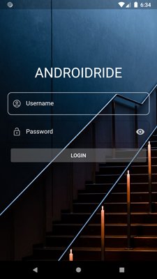
flutter login page with background image

Validation Demo:

flutter login page with validation

    • Using Form and TextFormFields, It’s easier to make a login page and also helpful to validate the inputs.
    • autofocus:true enables focus on username TextFormField.

text input action next

  • When username is typed and taps on the softkeyboard bottom Right Corner key defined using textInputAction: TextInputAction.next. It calls onFieldSubmitted(), and Change focus to next TextFormField.
class _MyAppState extends State {

  final white = Colors.white;
  final _passwordFocusNode = FocusNode();
  bool hidePassword = true;
  final _formKey = GlobalKey();


  final outlineInputBorder = OutlineInputBorder(
    borderRadius: BorderRadius.all(
      Radius.circular(10.0),
    ),
    borderSide: BorderSide(color: Colors.white),
  );


  @override
  Widget build(BuildContext context) {
    return MaterialApp(
      debugShowCheckedModeBanner: false,
      home: Scaffold(
        resizeToAvoidBottomInset: false,
        body: Center(
          child: Container(
            constraints: BoxConstraints.expand(),
            decoration: BoxDecoration(
              image: DecorationImage(
                image: AssetImage('assets/subway.jpg'),
                fit: BoxFit.cover,
              ),
            ),
            child: SingleChildScrollView(
              child: Center(
                child: Padding(
                  padding: const EdgeInsets.all(20.0),
                  child: Form(
                    key: _formKey,
                    child: Column(
                      crossAxisAlignment: CrossAxisAlignment.stretch,
                      children: [
                        SizedBox(
                          height: 150,
                        ),
                        Text(
                          'ANDROIDRIDE',
                          style: TextStyle(
                            fontSize: 36,
                            color: white,
                          ),
                          textAlign: TextAlign.center,
                        ),
                        SizedBox(
                          height: 30,
                        ),
                        TextFormField(
                          autofocus: true,//autofocus enabled.
                          onSaved: (newValue) 
                          {
                            //prints value when _formKey.currentState.save();
                            print("Username: $newValue");
                          },
                          validator: (value)//provides value in TextFormField
                          {
                            if (value.isEmpty) 
                            {//TextFormField is empty, show below text
                              return 'Please type your username';
                            }
                            //return null means successful validation.
                            return null;
                          },
                          onFieldSubmitted: (_) 
                          {//change Focus to next TextFormField (here password TextFormField)
                            FocusScope.of(context)
                                .requestFocus(_passwordFocusNode);
                          },
                          //soft keyboard shows next icon in bottom right corner
                          textInputAction: TextInputAction.next,
                          style: TextStyle(
                            color: white,
                          ),
                          maxLines: 1,
                          decoration: InputDecoration(
                            hintText: 'Username',
                            focusedBorder: outlineInputBorder,
                            border: outlineInputBorder,
                            hintStyle: TextStyle(
                              color: white,
                            ),
                            prefixIcon: const Icon(
                              Icons.account_circle_outlined,
                              color: Colors.grey,
                            ),
                          ),
                        ),
                        SizedBox(
                          height: 15,
                        ),
                        TextFormField(
                          maxLines: 1,
                          obscureText: hidePassword,//true hides password, false shows.
                          focusNode: _passwordFocusNode,
                          onSaved: (newValue) 
                          { //print value when _formKey.currentState.save() calls.
                            print("Password: $newValue");
                          },
                          validator: (value) 
                          {
                            //validates when _formKey.currentState.validate() calls.
                            if (value.isEmpty) {
                              return 'Enter your password';
                            }
                            if (value.length < 4) {
                              return 'password must be at least 4 characters';
                            }
                            return null;
                          },
                          style: TextStyle(
                            color: white,
                          ),
                          decoration: InputDecoration(
                            hintText: 'Password',
                            focusedBorder: outlineInputBorder,
                            border: outlineInputBorder,
                            hintStyle: TextStyle(
                              color: white,
                            ),
                            prefixIcon: const Icon(
                              Icons.lock_open_outlined,
                              color: Colors.white54,
                            ),
                            suffixIcon: IconButton(
                              onPressed: () {
                                setState(() 
                                {
                                  hidePassword = !hidePassword;
                                });
                              },
                              icon: Icon(
                                hidePassword
                                    ? Icons.visibility
                                    : Icons.visibility_off,
                                color: Colors.white70,
                              ),
                            ),
                          ),
                        ),
                        Padding(
                          padding: const EdgeInsets.all(8.0),
                          child: ElevatedButton(
                            style: ButtonStyle(
                              backgroundColor: MaterialStateProperty.all(
                                  Colors.white24),
                            ),
                            onPressed: () {
                              //calls _printFormValues() method
                              _printFormValues();
                            },
                            child: Text('LOGIN'),
                          ),
                        ),
                      ],
                    ),
                  ),
                ),
              ),
            ),
          ),
        ),
      ),
    );
  }
}


  • When both TextFields submitted and ElevatedButton tapped, it calls _printFormValues() method.
  • _formKey.currentState.validate() calls, it internally calls validator in TextFormFields, validates and returns true if there are no errors.
  • Otherwise shows text message which specified in validator.
  • _formKey.currentState.save() internally calls onSaved when there are no validation errors.
  • resizeToAvoidBottomInset: false, prevents resizing body.
  • Don’t forget to dispose the FocusNode.
  void _printFormValues() {
    final _isTrue = _formKey.currentState.validate();

    if (!_isTrue) {
      return;
    }
    _formKey.currentState.save();
  }

  @override
  void dispose() {
    _passwordFocusNode.dispose();
    super.dispose();
  }


flutter login page output

That’s all for now. Thank you.

More Information : Container Docs

2 Flutter Path Provider Examples With Tutorial

flutter path provider example
In this post, you will learn about the Flutter path_provider package.

What does it actually do?

Using the path_provider package, you can easily find the most commonly used locations in the device’s filesystem. It supports both iOS and Android.

Path provider methods – getApplicationDocumentDirectory() to latest ones

You can use these 8 methods to access device storage.

  1. getApplicationDocumentsDirectory(): Gives path to the directory where Application can place it’s private files, Files only get wiped out when application itself removed.
    iOSNSDocumentsDirectory API.
    Android – returns AppData directory.
  2. 
    
      final directory = await getApplicationDocumentsDirectory();


  3. getTemporaryDirectory(): This gives path to the temporary directory in device. Files can be deleted at any time.
    iOS – It uses NSCachesDirectory API
    Android – Use getCacheDir API
  4. getExternalStorageDirectories: It returns list of path of directories where app’s specific data can be stored. Commonly, path lives in external storage partitions or SD cards. Now it’s only available in Android, So before use, it’s better to find out the operating system. on iOS, it shows UnSupportedError.
    Android: it returns Context.getExternalFilesDirs(String type).
    Below API 19: Context.getExternalFilesDir(String type).
  5. getExternalStorageDirectory(): Only available in Android. Provides path to External storage(Generally SD card).

    This does not support in iOS, it will throw UnSupportedError if you use it.

  6. getDownloadsDirectory(): It returns path of the directory where downloaded files get stored. Not available in Android and iOS, it gives UnSupportedError.
  7. getExternalCacheDirectories(): It returns list of path of directories where app’s external cache data get stored. Commonly, these types of paths lives in SD cards and only available in Android, better check it out which OS is running because iOS throws UnSupportedError.

    Android – returns Context.getExternalCacheDirs().
    Below API 19 : Context.getExternalCacheDir() API.

  8. getLibraryDirectory():It returns path of the directory where app store persistent data such as sqlite.db, Not available in Android.
  9. getApplicationSupportDirectory(): It returns the directory where app place support files. It’s not recommended to use for user data files.

    iOS – Uses NSApplicationSupportDirectory API.
    Android – Uses getFilesDir API.

Let’s make a simple Create and Read File example, that will help you to learn about it better.

Flutter Path Provider Example – Create File and Read

path_provider example - Create File
In this example, you will learn how to create a text file, input from TextField using path provider and print to Text widget.

So let’s create a Flutter project named flutter_path_provider_example.


dependencies:
  flutter:
    sdk: flutter

  cupertino_icons: ^1.0.0
  path_provider: ^1.6.24

  • Open the project and pubspec.yaml, put path_provider package.


import 'package:flutter/material.dart';

void main() {
  runApp(PathProviderExample());
}

class PathProviderExample extends StatefulWidget {
  @override
  _PathProviderExampleState createState() => _PathProviderExampleState();
}

class _PathProviderExampleState extends State {
  @override
  Widget build(BuildContext context) {
    return Container();
  }
}

  • type stful for StatefulWidget and provide name – PathProviderExample


   final textController = TextEditingController();
   String text;


  • Create textController instance to access input from TextField.
  • text variable for storing text from TextField.
  • Put both of them in the State class.


@override
Widget build(BuildContext context) {
  return MaterialApp(
    title: 'Flutter Path Provider Example',
    home: Scaffold(
      appBar: AppBar(
        title: Text('Flutter Path Provider Example'),
      ),
      body: Column(
        children: [
          Padding(
            padding:
                const EdgeInsets.symmetric(horizontal: 18.0, vertical: 10),
            child: TextField(
              textAlign: TextAlign.center,//input aligns to center
              controller: textController,//assigns TextEditingController
            ),
          ),
          SizedBox(
            height: 10,
          ),
          ElevatedButton(
            child: Text('Create File'),
            onPressed: () => createFile(textController.text),//calls createFile() when //button pressed
          ),
          ElevatedButton(
            onPressed: () async {
              await readFile();//calls readFile()
              setState(() {});//rebuilds the UI.
            },
            child: Text('Read File'),
          ),
          SizedBox(
            height: 20,
          ),
          if (text != null) Text('$text')//text set if it's not null.
        ],
      ),
    ),
  );
}

  • Using Scaffold, simply make structure of the app.
  • Column arranges widget in vertical order.
  • Padding widget provides empty space around the TextField.
  • SizedBox gives some space between Widgets.
  • ElevatedButton is latest button provided by Flutter. (RaisedButton – obsolete now).

Let’s create createFile() method now.


Future createFile(String text) async {
//provides directory path.
    final directory = await getApplicationDocumentsDirectory();
//creates text_file in the provided path.
    final file = File('${directory.path}/text_file.txt');
    await file.writeAsString(text);
  }

  • import below statements to avoid red squiqqly lines:
    • import ‘dart:io’; – importing File class and methods.
    • import ‘package:path_provider/path_provider.dart’; – getApplicationDocumentsDirectory()
  • This is an asynchrononus method, so we need to use await and async keyword.
  • Input from the TextField is written to the text file.

just like createFile, make readFile() method.


Future readFile() async {
    try {
      final directory = await getApplicationDocumentsDirectory();
      final file = File('${directory.path}/text_file.txt');
      text = await file.readAsString();
    } catch (e) {
      print('exception');
    }
  }

  • text_file is read using readAsString() method.

Don’t forget to dispose TextEditingController.


    @override
  void dispose() {
    textController.dispose();
    super.dispose();
  }


Where files get stored when using getApplicationDocumentsDirectory() in Flutter?

Let’s check it out where is text_file get stored that we created in above example.

device file explorer android studio

Using Android Studio, View -> Tool Windows -> Device File Explorer.

text file location in path provider

Go for this location /data/data/com.androidride.flutter_path_provider_example/app_flutter/text_file.txt

Flutter Create Directory Example

flutter create directory example - path provider

In this flutter path provider example, you will learn how to create a directory using Path Provider package.

Just like the First Example, create a Flutter project and put path_provider pacakage in pubspec.yaml.

open main.dart and clear everything and type stless for StatelessWidget.


import 'package:flutter/material.dart';

void main() {
  runApp(MyApp());
}

class MyApp extends StatelessWidget 
{
  @override
  Widget build(BuildContext context) {
    return Container(
      
    );
  }
}


Before creating UI, let’s create createDir() method which creates directory.


  createDir() async {
    final directoryName = 'AndroidRide';
    final docDir = await getApplicationDocumentsDirectory();
    final myDir = Directory('${docDir.path}/$directoryName');

    if (await myDir.exists()) {
      print(myDir.path);
    }

    final dir = await myDir.create(recursive: true);
    print(dir.path);
  }

  • Import these:
    • import ‘dart:io’;

    • import ‘package:path_provider/path_provider.dart’;

Let’s complete the UI.


  @override
  Widget build(BuildContext context) {
    return MaterialApp(
      home: Scaffold(
        appBar: AppBar(
          title: Text('Flutter Create New Directory Example'),
        ),
        body: Container(
          padding: EdgeInsets.all(20.0),
          alignment: Alignment.topCenter,
          child: ElevatedButton(
            child: Text('Create Directory'),
            onPressed: () {
              createDir();
            },
          ),
        ),
      ),
    );
  }


The directory gets created when you tap on the “Create Directory” Button. Check it out the directory using Device File Explorer.

flutter create new directory example - path provider

That’s all for now.

More Information: path_provider

3 Image Picker Examples In Flutter With Tutorial

image picker flutter
In this tutorial, you will learn about Flutter Image_Picker plugin developed by flutter.dev community.

    It helps you to

  • Take pictures from Gallery and capture using camera
  • Take Videos from Gallery and record using camera

It’s better to use this plugin than start from scratch.

How to pick image from gallery or take a picture using Camera – Flutter Image_Picker?

flutter-imagepicker-example
Let’s make a simple example that deals with Flutter ImagePicker. So create a Flutter project named flutter_imagepicker_example – You can also use Flutter Create command

Before trying to do amazing things with Image_Picker plugin, Do not forget to add dependency in pubspec.yaml.

dependencies:
  flutter:
    sdk: flutter
  
  image_picker: ^0.6.7+14


This is the latest version. Starting from 0.6.7, API has changed a lot, If you are using the old versions of this plugin, You should migrate to the new version.

Most important, pickImage is deprecated, you should use ImagePicker.getImage() method instead.

image picker flutter info.plist

iOS developers – You need to add some key value pairs in this file /ios/Runner/Info.plist
ios permission for image picker in flutter


NSPhotoLibraryUsageDescription
Need to take picture from photo library

This will show iOS users when they tried to open the photo library.


NSCameraUsageDescription
Need to take picture using Camera

You don’t need to do anything with Android if you are trying to develop Apps for API 29+

If you are targeting API level below 29, then you need to add


android:requestLegacyExternalStorage="true"

Clean main.dart file and put the below code. You can easily create StatefulWidget by typing stful.

import 'package:flutter/material.dart';

void main() {
  runApp(ImagePickerExample());
}

class ImagePickerExample extends StatefulWidget {
  @override
  _ImagePickerExampleState createState() => _ImagePickerExampleState();
}

class _ImagePickerExampleState extends State {
  @override
  Widget build(BuildContext context) {
    return Container(
      
    );
  }
}

Put below code in state class.

//Holds image File
File _image;
//ImagePicker instance.
final picker = ImagePicker();

  • First, you need to create instance of ImagePicker and File.
  • then you need to import below statements.
    • import ‘dart:io’;
    • import ‘package:image_picker/image_picker.dart’;

Let’s create image taking method called _getImage().

//ImageSource: Camera and Gallery.
 _getImage(ImageSource imageSource) async 
{
    PickedFile imageFile = await picker.getImage(source: imageSource);
//if user doesn't take any image, just return.
    if (imageFile == null) return;

    setState(
      () {
//Rebuild UI with the selected image.
        _image = File(imageFile.path);
      },
    );
  }

  • You can directly use ImageSource.camera or ImageSource.gallery in getImage() method. In this way you can implement both features and reduce code.

Let’s complete the build method and make UI.


@override
  Widget build(BuildContext context) 
  {
    return MaterialApp(
      title: 'Flutter ImagePicker Example',
      home: Scaffold(
        appBar: AppBar(
          title: Text('Flutter Image_Picker Example'),
        ),
        body: Column(
          mainAxisAlignment: MainAxisAlignment.center,
          children: [
            Center(
              child: _image != null
                  ? Padding(
                      padding: const EdgeInsets.all(10.0),
                      child: Container(
                        width: 300,
                        height: 300,
                        child: Image.file(
                          _image,
                        ),
                      ),
                    )
                  : Padding(
                      padding: const EdgeInsets.all(18.0),
                      child: Text('No image selected'),
                    ),
            ),
            Row(
              mainAxisAlignment: MainAxisAlignment.spaceEvenly,
              children: [
                ElevatedButton.icon(
                  onPressed: () => _getImage(ImageSource.gallery),
                  icon: Icon(Icons.image),
                  label: Text('gallery'),
                ),
                ElevatedButton.icon(
                  onPressed: () => _getImage(ImageSource.camera),
                  icon: Icon(Icons.camera),
                  label: Text('camera'),
                ),
              ],
            ),
          ],
        ),
      ),
    );
  }

Let’s talk about ImagePicker pickImage() arguments:

  • source: Gallery or Camera.
  • imageQuality: value ranges from 0-100, where 100 is max/original quality. If it’s null, the original quality returned.
  • maxHeight: specify the maximum height of the Image, if it’s not specified original height returned.
  • maxWidth: specify the maximum width of the Image, if it’s null original width returned.
  • preferredCameraDevice: By default, it uses CameraDevice.rear. You can change it to CameraDevice.front.

Flutter Image_Picker – Capture Image & Store Example

image_picker flutter camera take picture
In this example, you will capture an image using camera and store it in the device storage.
Create a Flutter project named imagepicker_save_example
open pubspec.yaml, Just like mentioned above, add imagepicker dependency with path and path_provider.

  image_picker: 0.6.7+14
  path_provider: ^1.6.24
  path: ^1.7.0

  • path: Helps us to join path(usage – in this example).
  • path_provider: It gives directory location to store images(usage- in this example).
  • Don’t forget to add iOS permissions and Android, just like first Example. Check out First example, if you don’t know how to do it.

clean main.dart file, and type stful and make StatefulWidget, don’t forget to add main method and import statement or copy the below code.


import 'package:flutter/material.dart';

void main() => runApp(ImageSave());

class ImageSave extends StatefulWidget {
  @override
  _ImageSaveState createState() => _ImageSaveState();
}

class _ImageSaveState extends State {
  @override
  Widget build(BuildContext context) {
    return Container();
  }
}

just like the first example, create File and ImagePicker instance in state class.


File _image;

final picker = ImagePicker();


Now it’s time to make _getImage() and store it in the device storage.


  _getImage() async 
{
//ImageSource: camera
    PickedFile imageFile = await picker.getImage(source: ImageSource.camera);
//If there is no image selected, return.
    if (imageFile == null) return;
//File created.
    File tmpFile = File(imageFile.path);
//it gives path to a directory - path_provider package.
    final appDir = await getApplicationDocumentsDirectory();
//filename - returns last part after the separator - path package.
    final fileName = basename(imageFile.path);
//copy the file to the specified directory and return File instance.
    tmpFile = await tmpFile.copy('${appDir.path}/$fileName');
//prints file location
    print('File path is :${tmpFile.path}');

    setState(() {
      _image = tmpFile;
    });
  }

  • Copy and paste the below statements.

    • import ‘package:path/path.dart’;
    • import ‘package:path_provider/path_provider.dart’;

Let’s build the User Interface of this app.

 @override
  Widget build(BuildContext context) {
    return MaterialApp(
      title: 'Flutter ImagePicker - Save Image Example',
      home: Scaffold(
        appBar: AppBar(
          title: Text('Flutter ImagePicker - Save Image Example'),
        ),
        body: Column(
          mainAxisAlignment: MainAxisAlignment.start,
          children: [
            Center(
              child:  _image != null
        ?Container(
                height: 300,
                child: Padding(
                        padding: const EdgeInsets.all(8.0),
                        child: Image.file(
                          _image,
                        ),
                      ),)
                    : Padding(
                      padding: const EdgeInsets.all(8.0),
                      child: Text('No Image found'),
                    ),

            ),
            ElevatedButton(
              child: Text('Capture and Store Image'),
              onPressed: _getImage,
            )
          ],
        ),
      ),
    );
  }

How to view those Image Files stored in Emulator/Device?

view saved images in flutter
In Android Studio, View -> Tool Windows -> Device File Explorer.
image location
Based on this example, images located inside data/data/com.example.imagepicker_save_example/app_flutter/image files.

How to take Video from Gallery or capture using Camera – Flutter ImagePicker

flutter image_picker record video example
Using ImagePicker, you can pick and capture videos too. So in this example, you will select or record video using ImagePicker and play it using video_player.

So create a project named flutter_imagepicker_video_example, that’s a long name.

After the project created, open pubspec.yaml and paste the below dependencies,


video_player: ^1.0.1
image_picker: ^0.6.7+14

iOS – ImagePicker

put below keys to info.plist file, located in /ios/Runner/Info.plist.

        NSPhotoLibraryUsageDescription
	permission needed - photo library
	NSCameraUsageDescription
	permission needed - camera
	NSMicrophoneUsageDescription
	permission needed - microphone

Android

if you are making an app for the above API 29, there is no configuration required. For below API 29, add the below attribute to the tag in AndroidManifest.xml.


android:requestLegacyExternalStorage="true"

Let’s configure video_player…

iOS – video_player

Paste below entries to info.plist file


NSAppTransportSecurity

  NSAllowsArbitraryLoads


Actually, these keys allow using Video files by URLs.

Android

paste the permission in AndroidManifest.xml


clear your main.dart file and make statefulWidget by typing stful and paste below code.


import 'package:flutter/material.dart';

void main() {
  runApp(VideoImagePicker());
}

class VideoImagePicker extends StatefulWidget {
  @override
  _VideoImagePickerState createState() => _VideoImagePickerState();
}

class _VideoImagePickerState extends State {
  @override
  Widget build(BuildContext context) {
    return Container();
  }
}


Let’s make a _pickVideo() method to take video.

//VideoPlayerController instance
VideoPlayerController _videoPlayerController;
//_video holds the selected video file.
  File _video;
//ImagePicker initialized.
  final picker = ImagePicker();

  _pickVideo(ImageSource imagesource) async 
{
    PickedFile pickedFile = await picker.getVideo(source: imagesource);
//User doesn't take the video, return
    if (pickedFile == null) return null;
//_video holds video file.
    _video = File(pickedFile.path);
//Initialize VideoPlayerController with the selected file and rebuild.
    _videoPlayerController = VideoPlayerController.file(_video)
      ..initialize().then((value) {
        setState(() {});
        _videoPlayerController.play();
      });
  }


Let’s build the UI

  
  @override
  Widget build(BuildContext context) {
    return MaterialApp(
        home: Scaffold(
          appBar: AppBar(
            title: Text('Flutter ImagePicker - Pick Video Example'),
          ),
          body: Container(
            child: Center(
              child: Column(
                mainAxisAlignment: MainAxisAlignment.center,
                children: [
                  (_video != null && _videoPlayerController.value.initialized)
                      ? Expanded(
                    child: AspectRatio(
                      aspectRatio: _videoPlayerController.value.aspectRatio,
                      child: VideoPlayer(_videoPlayerController),
                    ),
                  )
                      : Padding(
                    padding: const EdgeInsets.all(8.0),
                    child: Text('No Videos selected'),
                  ),
                  ElevatedButton.icon(
                    icon: Icon(Icons.camera),
                    onPressed: () {
                      _pickVideo(ImageSource.camera);
                    },
                    label: Text('Record Video Using Camera'),
                  ),
                  ElevatedButton.icon(
                    icon: Icon(Icons.photo),
                    onPressed: () {
                      _pickVideo(ImageSource.gallery);
                    },
                    label: Text('Pick Video From Gallery'),
                  ),
                ],
              ),
            ),
          ),
        ));
  }


That’s all for now. if you like this post, please share it with your family and friends.
ImagePicker Flutter

3 Flutter Swiper Examples With Tutorial

In this post, you will learn about the Flutter Swiper package. Using this library, you can create image Carousel.

flutter swiper example

Let’s make a simple image carousel like above.

Create a Flutter project in Android Studio or Visual Studio. If you don’t know how to create a Flutter project in Android Studio, then read this post Android Studio Flutter Project Setup.

You can also use flutter commands to create project.

Let’s start with adding flutter_swiper dependency in pubspec.yaml.


flutter_swiper: ^1.1.6

Put below code in main.dart file


import 'package:flutter/material.dart';
import 'package:flutter_swiper/flutter_swiper.dart';

void main() {
  runApp(MyApp());
}

class MyApp extends StatelessWidget {
  final imageList = [
    'https://cdn.pixabay.com/photo/2016/03/05/19/02/hamburger-1238246__480.jpg',
    'https://cdn.pixabay.com/photo/2016/11/20/09/06/bowl-1842294__480.jpg',
    'https://cdn.pixabay.com/photo/2017/01/03/11/33/pizza-1949183__480.jpg',
    'https://cdn.pixabay.com/photo/2017/02/03/03/54/burger-2034433__480.jpg',
  ];

  @override
  Widget build(BuildContext context) {
    return MaterialApp(
      home: Scaffold(
        backgroundColor: Colors.grey,
        body: Swiper(
          itemCount: imageList.length,
          itemBuilder: (context, index) {
            return Image.network(
              imageList[index],
              fit: BoxFit.cover,
            );
          },
        ),
      ),
    );
  }
}
  • imageList contains list of image urls.
  • Specifies no. of images using itemCount property of Swiper.
  • Swiper widget builds carousel using image urls with the help of Image.network widget.

horizontal swipe flutter
You can change scrollDirection using scrollDirection property.


scrollDirection: Axis.vertical,

dots in swiper flutter
Now add some circle or dots at the bottom to understand how many slides are in the carousel.

 pagination: SwiperPagination(),

swiperpagination fraction flutter
Change dots and replace them with numbers.

pagination: SwiperPagination(builder: SwiperPagination.fraction),

flutter swiper control

Let’s add some control buttons on, left, and right sides.

 control: SwiperControl(),

Now you can click on both buttons to change the slides or images without swiping.

black arrows swiper

Sometimes you need to change the color of arrows, then you can use the color property.

 control: SwiperControl(color: Colors.black),

If you need to change images without swiping or taping control buttons, then you can use autoplay:true

Swiper(
          autoplay: true,
          itemCount: imageList.length,
          itemBuilder: (context, index) {
            return Image.network(
              imageList[index],
              fit: BoxFit.cover,
            );
          },
        //scrollDirection: Axis.vertical,
          //pagination: SwiperPagination(builder: SwiperPagination.fraction),
          //control: SwiperControl(color: Colors.black),
        ),

Okay. If you need to do any operation when tapping on the image, then you can use onTap

property.

Swiper(
          onTap: (index) {
            print(imageList[index]);
          },
          itemCount: imageList.length,
          itemBuilder: (context, index) {
            return Image.network(
              imageList[index],
              fit: BoxFit.cover,
            );
          },
          //autoplay: true,
          //scrollDirection: Axis.vertical,
          //pagination: SwiperPagination(builder: SwiperPagination.fraction),
          //control: SwiperControl(color: Colors.black),
        ),
  • When user taps on image, it prints image url from the imageList

If you are trying to refresh the UI after onTap triggered, then you must convert the class into a StatefulWidget and call setState() inside onTap method block.

Stack Layout Example

flutter swiper stack layout example

In this example, you will learn how to make a stack layout carousel using the same Image URLs used in the first example.


import 'package:flutter/material.dart';
import 'package:flutter_swiper/flutter_swiper.dart';

void main() {
  runApp(MyApp());
}

class MyApp extends StatelessWidget {
  final imageList = [
    'https://cdn.pixabay.com/photo/2016/03/05/19/02/hamburger-1238246__480.jpg',
    'https://cdn.pixabay.com/photo/2016/11/20/09/06/bowl-1842294__480.jpg',
    'https://cdn.pixabay.com/photo/2017/01/03/11/33/pizza-1949183__480.jpg',
    'https://cdn.pixabay.com/photo/2017/02/03/03/54/burger-2034433__480.jpg',
  ];

  @override
  Widget build(BuildContext context) {
    return MaterialApp(
      home: Scaffold(
        body: Swiper(
          layout: SwiperLayout.STACK,
          itemCount: imageList.length,
          itemBuilder: (context, index) {
            return Image.network(
              imageList[index],
              fit: BoxFit.cover,
            );
          },
          itemWidth: 300.0,
          itemHeight: 300.0,
        ),
      ),
    );
  }
}


  • Here layout property uses SwiperLayout.STACK.
  • Image’s height and width set to 300.0

SwiperLayout Tinder Example

flutter swiper tinder example
In this example, You will use SwiperLayout.TINDER for layout property.

import 'package:flutter/material.dart';
import 'package:flutter_swiper/flutter_swiper.dart';

void main() {
  runApp(MyApp());
}

class MyApp extends StatelessWidget {
  final imageList = [
    'https://cdn.pixabay.com/photo/2016/03/05/19/02/hamburger-1238246__480.jpg',
    'https://cdn.pixabay.com/photo/2016/11/20/09/06/bowl-1842294__480.jpg',
    'https://cdn.pixabay.com/photo/2017/01/03/11/33/pizza-1949183__480.jpg',
    'https://cdn.pixabay.com/photo/2017/02/03/03/54/burger-2034433__480.jpg',
  ];

  @override
  Widget build(BuildContext context) {
    return MaterialApp(
      home: Scaffold(
        appBar: AppBar(
          title: Text('Flutter Swiper TINDER Example'),
        ),
        body: Swiper(
          layout: SwiperLayout.TINDER,
          itemCount: imageList.length,
          itemBuilder: (context, index) {
            return Image.network(
              imageList[index],
              fit: BoxFit.cover,
            );
          },
          itemWidth: 400.0,
          itemHeight: 500.0,
        ),
      ),
    );
  }
}


Flutter Swiper Example – Using customLayoutOption

flutter swiper example - custom animation
This is a simple customized example.

import 'package:flutter/material.dart';
import 'package:flutter_swiper/flutter_swiper.dart';

void main() {
  runApp(MyApp());
}

class MyApp extends StatelessWidget {
  final imageList = [
    'https://cdn.pixabay.com/photo/2016/03/05/19/02/hamburger-1238246__480.jpg',
    'https://cdn.pixabay.com/photo/2016/11/20/09/06/bowl-1842294__480.jpg',
    'https://cdn.pixabay.com/photo/2017/01/03/11/33/pizza-1949183__480.jpg',
    'https://cdn.pixabay.com/photo/2017/02/03/03/54/burger-2034433__480.jpg',
  ];

  @override
  Widget build(BuildContext context) {
    return MaterialApp(
      home: Scaffold(
          body: Swiper(
              layout: SwiperLayout.CUSTOM,
              customLayoutOption:
                  new CustomLayoutOption(startIndex: -1, stateCount: 3)
                      .addRotate([0.0 / 180, 0.0, 0.0 / 180]).addTranslate([
                new Offset(-310.0, 0.0),
                new Offset(0.0, 0.0),
                new Offset(310.0, 0.0) //for right element
              ]),
              itemWidth: 300.0,
              itemHeight: 200.0,
              itemBuilder: (context, index) {
                return Image.network(
                  imageList[index],
                  fit: BoxFit.cover,
                );
              },
              itemCount: imageList.length)),
    );
  }
}


So as an open-source, you can use this library and make your own Image Carousel.

Flutter Swiper Package

That’s all for now. If you like this post, please share it with your family and friends.

flutter swiper example

5 FloatingActionButton Examples In Flutter With Tutorial

floating button flutter example

In this tutorial, you will learn about the Floating Action Button in Flutter.

What is FloatingActionButton or Floating Button in Flutter?

floating button flutter
FloatingActionButton is a simple button floating above the body at the bottom right corner. Provides immediate access for a primary function.

For example, the Gmail app.

When you are trying to composing a new mail, you are tapping the FloatingActionButton.

How to make a FloatingActionButton in Flutter

It’s very simple because Scaffold provides a floatingActionbutton property. You just need to give its value. Okay…Let’s create a simple Flutter project
with FloatingActionbutton.

You can also use Flutter commands to create a project.


import 'package:flutter/material.dart';

void main() {
  runApp(MyApp());
}

class MyApp extends StatelessWidget {
  @override
  Widget build(BuildContext context) {
    return MaterialApp(
      home: Scaffold(
        //body: Container(),
        floatingActionButton: FloatingActionButton(
          backgroundColor: Colors.blue,
          onPressed: () {},
        ),
      ),
    );
  }
}

This will be the output of the above code.
floating button flutter without icon

For adding an icon in FloatingActionButton or FAB, just add child property and Icon as value. Like shown below


child: Icon(Icons.add),

Now the output will be like below.

flutter floatingactionbutton with icon


class MyApp extends StatelessWidget {
  @override
  Widget build(BuildContext context) {
    return MaterialApp(
      home: Scaffold(
        //body: Container(),
        floatingActionButton: FloatingActionButton(
          backgroundColor: Colors.blue,
          child: Icon(Icons.add),
          onPressed: () {},
        ),
      ),
    );
  }
}


This is just a simple example, If you want to redraw your widget you need to convert StatelessWidget in to StatefulWidget and call setState() method.

There are 2 types of FloatingActionButton constructors are available now.

1) FloatingActionButton() constructor – You have seen that how to use this constructor in above example.
2) FloatingActionButton.extended() – It just needs label as extra property.

FloatingActionButton.extended() – Example

In this example, we are using the second constructor of FloatingActionButton.

flutter FAB extended constructor

import 'package:flutter/material.dart';

void main() {
  runApp(MyApp());
}

class MyApp extends StatelessWidget {
  @override
  Widget build(BuildContext context) {
    return MaterialApp(
      home: Scaffold(
        //body: Container(),
        floatingActionButton: FloatingActionButton.extended(
          icon: Icon(Icons.add),
          label: Text('Add Note'),
          onPressed: () {
            print('FloatingActionButton clicked');
          },
        ),
      ),
    );
  }
}

How to change color of FloatingACtionButton in Flutter?

floating button flutter background color

Use backgroundColor property and provide any Colors value as you want. just like below.


Scaffold(
        //body: Container(),
        floatingActionButton: FloatingActionButton(
          backgroundColor: Colors.deepPurple,
          child: Icon(Icons.add),
          onPressed: () {},
        ),
      ),

Flutter Bottom Navigation Bar With FAB

floatingactionbutton flutter centerdocked
Do you want to make an app look like above?

In this example, you will create a BottomAppBar using bottomNavigationBar property with FloatingActionButton. For aligning FAB, Use Scaffold’s floatingActionButtonLocation property.

Step 1

Let’s start with creating FAB…


return MaterialApp(
      home: Scaffold(
        backgroundColor: Colors.grey,
        floatingActionButton: FloatingActionButton(
          backgroundColor: Colors.red,
          onPressed: () {},
          child: const Icon(
            Icons.edit,
            color: Colors.white,
          ),
        ),
      ),
    );

  • Use backgroundColor property to set FAB’s color.

Step 2

It’s time to add BottomAppBar and it’s childrens.

  @override
  Widget build(BuildContext context) {
return MaterialApp(
      home: Scaffold(
        backgroundColor: Colors.grey,
        floatingActionButton: FloatingActionButton(
          backgroundColor: Colors.red,
          onPressed: () {},
          child: const Icon(
            Icons.edit,
            color: Colors.white,
          ),
        ),
        bottomNavigationBar: BottomAppBar(
          child: Row(
            mainAxisAlignment: MainAxisAlignment.spaceAround,
            children: [
              IconButton(
                icon: Icon(Icons.home),
                color: Colors.black,
                onPressed: () {},
              ),
              IconButton(
                icon: Icon(Icons.search),
                color: Colors.black,
                onPressed: () {},
              ),
              SizedBox(
                width: 40,
              ),
              IconButton(
                icon: Icon(Icons.add_shopping_cart),
                color: Colors.black,
                onPressed: () {},
              ),
              IconButton(
                icon: Icon(Icons.account_box),
                color: Colors.black,
                onPressed: () {},
              ),
            ],
          ),
        ),
      ),
    );
}
  • Row aligns IconButtons in BottomAppBar

if you run the code now, the output should look like below.
floatingactionbutton flutter and bottomnavigationbar property

Next, you need to set FloatingActionButton in the center of BottomAppBar.

Step 3

You don’t need to use any other widgets to set FAB’s location. Just use FloatingActionButtonLocation class values.


floatingActionButtonLocation: FloatingActionButtonLocation.centerDocked,

  • It should be inside of Scaffold constructor.

Now the output will look like below.

floatingactionbutton in flutter without notch

Here you can see that FAB just floats above the BottomAppBar, that’s not what you want.

I know that. But if someone wants this type of style. This might help them.

Step 4

Create a notch using BottomAppBar’s shape property.

bottomNavigationBar: BottomAppBar(
shape: CircularNotchedRectangle(),
...

Source code should look like below.


import 'package:flutter/material.dart';

void main() {
  runApp(MyApp());
}

class MyApp extends StatelessWidget {
  @override
  Widget build(BuildContext context) {
    return MaterialApp(
      home: Scaffold(
        appBar: AppBar(),
        backgroundColor: Colors.grey,
        floatingActionButton: FloatingActionButton(
          backgroundColor: Colors.red,
          onPressed: () {},
          child: const Icon(
            Icons.edit,
            color: Colors.white,
          ),
        ),
        floatingActionButtonLocation: FloatingActionButtonLocation.centerDocked,
        bottomNavigationBar: BottomAppBar(
          shape: CircularNotchedRectangle(),
          child: Row(
            mainAxisAlignment: MainAxisAlignment.spaceAround,
            children: [
              IconButton(
                icon: Icon(Icons.home),
                color: Colors.black,
                onPressed: () {},
              ),
              IconButton(
                icon: Icon(Icons.search),
                color: Colors.black,
                onPressed: () {},
              ),
              SizedBox(
                width: 40,
              ),
              IconButton(
                icon: Icon(Icons.add_shopping_cart),
                color: Colors.black,
                onPressed: () {},
              ),
              IconButton(
                icon: Icon(Icons.account_box),
                color: Colors.black,
                onPressed: () {},
              ),
            ],
          ),
        ),
      ),
    );
  }
}

You got it now.

floatingactionbutton flutter centerdocked

How to change floating action button position in flutter

FloatingActionButtonLocation class provides different types of location constants to align the FloatingActionButton.


floatingActionButtonLocation:
            FloatingActionButtonLocation.miniEndDocked,
  1. centerDocked
  2. centerFloat
  3. centerTop
  4. endDocked
  5. endFloat
  6. endTop
  7. miniCenterDocked
  8. miniCenterFloat
  9. miniCenterTop
  10. miniEndDocked
  11. miniEndFloat
  12. miniEndTop
  13. miniStartDocked
  14. miniStartFloat
  15. miniStartTop
  16. startDocked
  17. startFloat
  18. startTop

Flutter 2 or Multiple FloatingActionButton Menu Example – Using Unicorndial package

multiple floating action button menu in flutter

In this example, you will learn how to create Multiple FloatingActionButton menu using the Unicorndial package.

So first add dependencies in pubspec.yaml.


unicorndial: ^1.1.5


Just put the below code in your dart file.


import 'package:flutter/material.dart';
import 'package:unicorndial/unicorndial.dart';

void main() => runApp(
      new MaterialApp(
        title: "Flutter Multiple FloatingActionButton Example",
        home: MyApp(),
      ),
    );

class MyApp extends StatefulWidget {
  _MyAppState createState() => _MyAppState();
}

class _MyAppState extends State {
  @override
  Widget build(BuildContext context) {
    final floatingButtons = List();

    floatingButtons.add(
      UnicornButton(
        hasLabel: true,
        labelText: "Attachment",
        currentButton: FloatingActionButton(
          heroTag: "attachment",
          backgroundColor: Colors.black,
          mini: true,
          child: Icon(Icons.attach_file),
          onPressed: () {
            print('Attachment FAB clicked');
          },
        ),
      ),
    );

    floatingButtons.add(
      UnicornButton(
        hasLabel: true,
        labelText: "Camera",
        currentButton: FloatingActionButton(
          onPressed: () {
            print('Camera FAB clicked');
          },
          heroTag: "camera",
          backgroundColor: Colors.black,
          mini: true,
          child: Icon(Icons.photo_camera),
        ),
      ),
    );

    floatingButtons.add(
      UnicornButton(
        hasLabel: true,
        labelText: "Create Note",
        currentButton: FloatingActionButton(
          onPressed: () {
            print('Note FAB clicked');
          },
          heroTag: "note",
          backgroundColor: Colors.black,
          mini: true,
          child: Icon(Icons.note_add),
        ),
      ),
    );

    return Scaffold(
      floatingActionButton: UnicornDialer(
          backgroundColor: Colors.black38,
          parentButtonBackground: Colors.brown,
          orientation: UnicornOrientation.VERTICAL,
          parentButton: Icon(Icons.add),
          childButtons: floatingButtons),
      appBar: AppBar(
        title: Text('Flutter Multiple FloatingActionButton Example'),
      ),
      body: Container(),
    );
  }
}


  • In this example, you are creating List of UnicornButtons and pass it to UnicornDialer.
  • You can change orientation to horizontal using UnicornOrientation.HORIZONTAL value.
  • If there are multiple FloatingACtionButton, you need to provide a unique heroTag value.

FloatingButton onPressed Example

floating button flutter
In this example, you will create a counter app using FloatingActionButton.

import 'package:flutter/material.dart';

void main() {
  runApp(MyApp());
}

class MyApp extends StatelessWidget {
  @override
  Widget build(BuildContext context) {
    return MaterialApp(
      title: 'FloatingActionButton - onPressed Example',
      theme: ThemeData(
        primarySwatch: Colors.blue,
        visualDensity: VisualDensity.adaptivePlatformDensity,
      ),
      home: MyHomePage(),
    );
  }
}

class MyHomePage extends StatefulWidget {
  @override
  _MyHomePageState createState() => _MyHomePageState();
}

class _MyHomePageState extends State {
  int counter = 0;

  @override
  Widget build(BuildContext context) {
    return Scaffold(
      appBar: AppBar(
        title: Text('FloatingActionButton onPressed Example'),
      ),
      body: Center(
        child: Text(
          '$counter',
          style: TextStyle(fontSize: 150.0, fontWeight: FontWeight.bold),
        ),
      ),
      floatingActionButton: FloatingActionButton(
        onPressed: () {
          setState(
            () {
              counter++;
            },
          );
        },
        child: Icon(
          Icons.plus_one,
        ),
        backgroundColor: Colors.redAccent,
      ),
      floatingActionButtonLocation: FloatingActionButtonLocation.centerFloat,
    );
  }
}

  • When the FAB is clicked, it will call setState method with updating counter variable value.
  • setState() method re-runs build() method, that updates Text value.

Let’s learn about other FloatingActionButton properties.

How to disable FloatingActionButton in Flutter

It is easy to disable FloatingActionButton, just provide a null value for onPressed property. But it is not recommended, because there is no sign that FAB is disabled, So it’s better to change the background color of FAB while it’s in a disabled state.

How to reduce FloatingActionButton size in Flutter?

flutter FAB mini true
By default, FloatingActionButton’s width and height are 56.0 logical pixels. Using mini property, you can reduce the Floating Button size to 48.0 logical pixels in both width and height.


floatingActionButton: FloatingActionButton(
          onPressed: () {},
          child: Icon(Icons.add),
          mini: true,
        ),

Different types of Shapes – FloatingActionButton Examples

Not an only circle, but you can also make FloatingActionButton into different shapes, Using the shape property.

rectangular fab


floatingActionButton: FloatingActionButton(
          onPressed: () {},
          child: Icon(Icons.account_box),
          shape: RoundedRectangleBorder(),
        ),

beveledrectangleborder shape fab


floatingActionButton: FloatingActionButton(
          onPressed: () {},
          child: Icon(Icons.account_box),
          shape: BeveledRectangleBorder(
            borderRadius: BorderRadius.circular(12),
          ),
        ),

outlineinputborder fab shape flutter


floatingActionButton: FloatingActionButton(
          onPressed: () {},
          child: Icon(Icons.account_box),
          shape: OutlineInputBorder(),
        ),

underlineinputborder shape flutter

 floatingActionButton: FloatingActionButton(
          onPressed: () {},
          child: Icon(Icons.account_box),
          shape: UnderlineInputBorder(),
        ),

circleborder with width shape flutter fab


floatingActionButton: FloatingActionButton(
          onPressed: () {},
          child: Icon(Icons.account_box),
          shape: CircleBorder(
            side: BorderSide(
              width: 3.0,
              color: Colors.pink,
            ),
          ),
        ),

elevation

floating button elevation in flutter
elevation property helps to control the shadow behind the FloatingActionButton. Default value is 6.


floatingActionButton: FloatingActionButton(
        onPressed: () {},
        elevation: 15.0,
        child: Icon(Icons.add),
      ),
  • elevation changed to 15.0

Okay… That’s all for now. If you like this article, please share it.

FloatingActionButton Flutter Docs